Thread
Robinhood. Yahoo. Google Finance.
3 fintech behemoths. 1 neat tactic:
A different variation of red.
Why?
Here's a quick breakdown: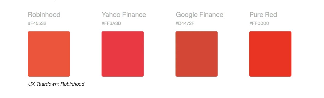
3 fintech behemoths. 1 neat tactic:
A different variation of red.
Why?
Here's a quick breakdown:

Red is a color generally associated with failure and fear.
And Robinhood doesn't want that.
Fearful users = lesser transactions.
For Robinhood, that means less money
So what do they do instead?
And Robinhood doesn't want that.
Fearful users = lesser transactions.
For Robinhood, that means less money
So what do they do instead?
They subscribe to my newsletter.
Okay maybe not...
But they did something equally simple, they made that Red a bit more Orange.
And how does that help?
Okay maybe not...
But they did something equally simple, they made that Red a bit more Orange.
And how does that help?
Simple color psychology:
Orange is associated with optimism and energy - the ideal association for these brands.
Optimistic users will spend more.
More transactions = more money.
I love this tactic cause it's so simple...
Orange is associated with optimism and energy - the ideal association for these brands.
Optimistic users will spend more.
More transactions = more money.
I love this tactic cause it's so simple...
If you want more actionable tactics like this, check out my free newsletter:
Psychology of Marketing
I share science-backed marketing tactics like this every Thursday.
The only difference? I dig a lot deeper and the emails look a lot better ;) psychologyofmarketing.beehiiv.com/?utm_source=twitter&utm_medium=social&utm_campaign=short_threads
Psychology of Marketing
I share science-backed marketing tactics like this every Thursday.
The only difference? I dig a lot deeper and the emails look a lot better ;) psychologyofmarketing.beehiiv.com/?utm_source=twitter&utm_medium=social&utm_campaign=short_threads
I'm curious, can you think of any other brands that use, or may benefit, from such color-based design tactics?
I'd love to hear about them :)
I'd love to hear about them :)