Thread
Intuitiveness comes from familiarity
Make your Dashboards 5 times more intuitive using this trick
/🧵/
Make your Dashboards 5 times more intuitive using this trick
/🧵/

Z-pattern eye movement
Determine if the visual flow of the dashboard goes from most important to least important information
Usually, your eyes move from left to right in the Z-pattern
(Assumption that cultural dialects go from left to right)
Determine if the visual flow of the dashboard goes from most important to least important information
Usually, your eyes move from left to right in the Z-pattern
(Assumption that cultural dialects go from left to right)
Make sure your visualizations help you look at places with more important information before the least 

Another rule of thumb is to start high and drill down to specific
Look that the chart starts with high-level KPIs and finishes with table details
This flow is important if you want to bring a logical story to your dashboard
Look that the chart starts with high-level KPIs and finishes with table details
This flow is important if you want to bring a logical story to your dashboard
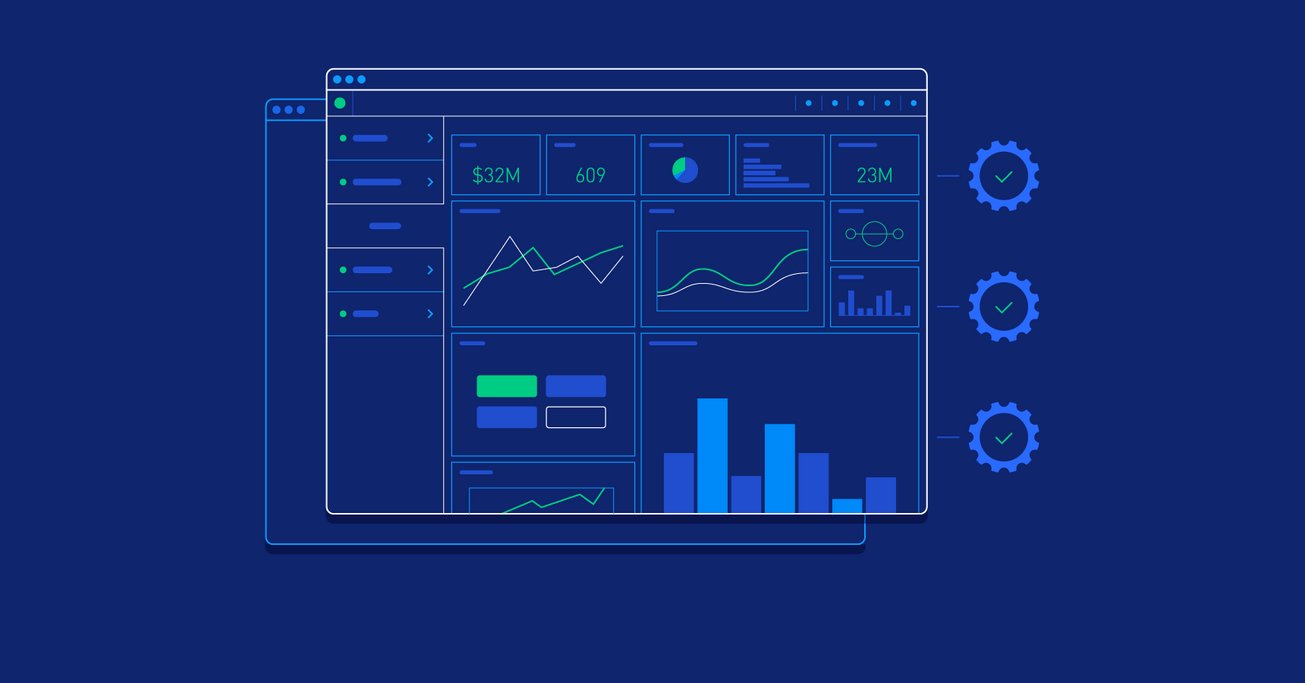
As you can see in this example, the level of detail flows in the Z pattern
KPI -> Charts -> Tabular details
Look how the slicers are placed where info can be easily missed
KPI -> Charts -> Tabular details
Look how the slicers are placed where info can be easily missed

That's a wrap!
If you enjoyed this thread:
1. Follow me @freest_man for more of these
2. Subscribe to my newsletter for more ---> sasi.beehiiv.com/subscribe
If you enjoyed this thread:
1. Follow me @freest_man for more of these
2. Subscribe to my newsletter for more ---> sasi.beehiiv.com/subscribe
Mentions
See All
Afiz ⚡️ @itsafiz
·
Feb 7, 2023
insightful thread 👏