Thread
It took me 2 minutes to create this pie chart in Excel.
This is clearly a horrible visualization.
Lying with data became easy.
How to avoid unethical data presentation?
🧵
1/7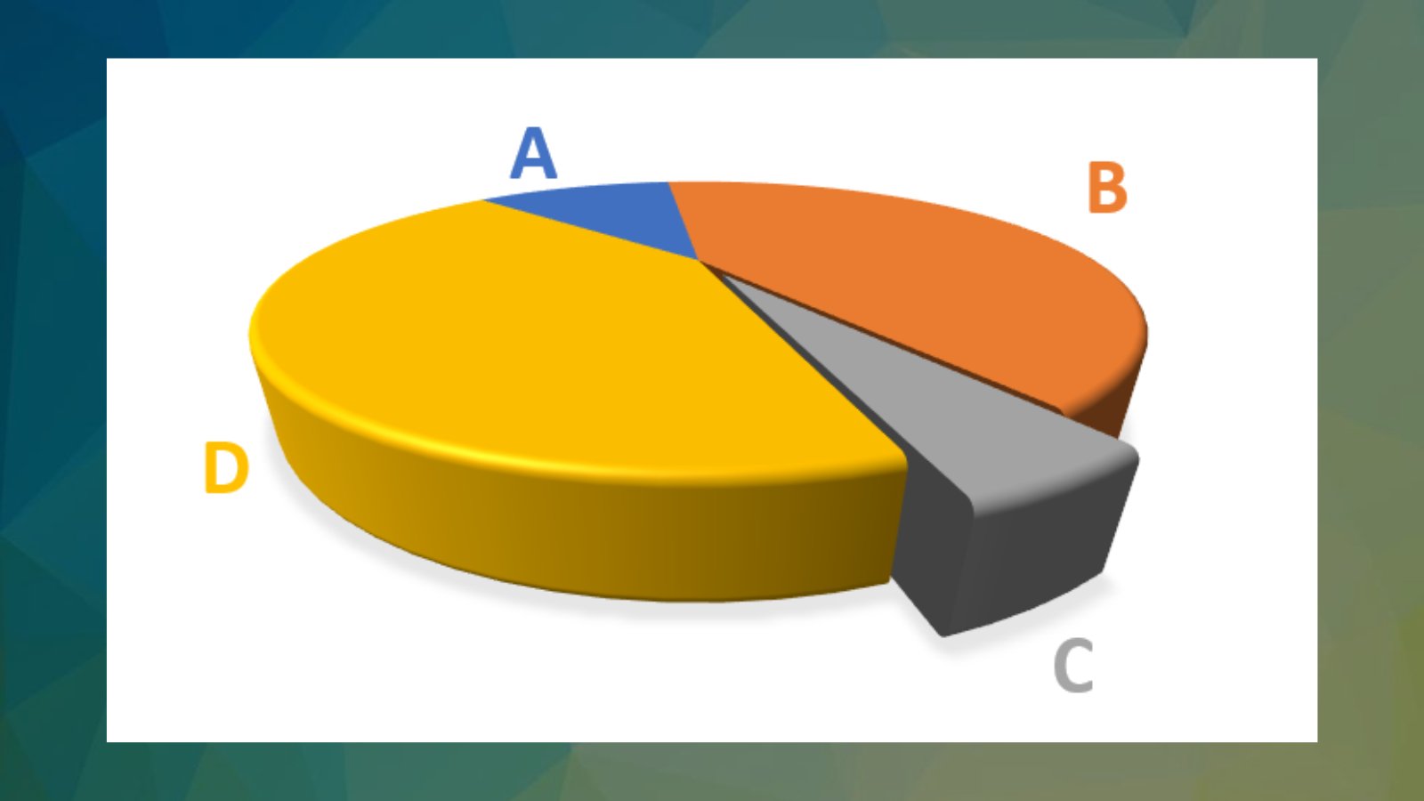
This is clearly a horrible visualization.
Lying with data became easy.
How to avoid unethical data presentation?
🧵
1/7

1. Choose visualizations wisely.
Use visualizations that accurately represent the data and avoid using charts or graphs that can be misleading, like the pie chart above.
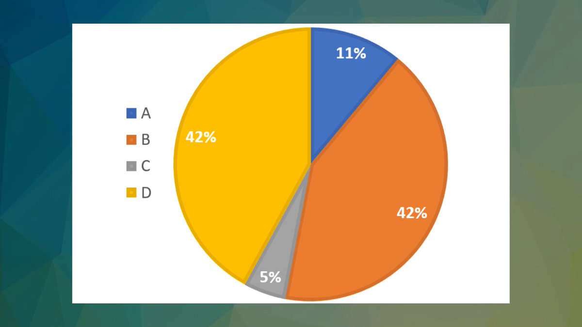
(Here is another perspective for the chart above)
2/7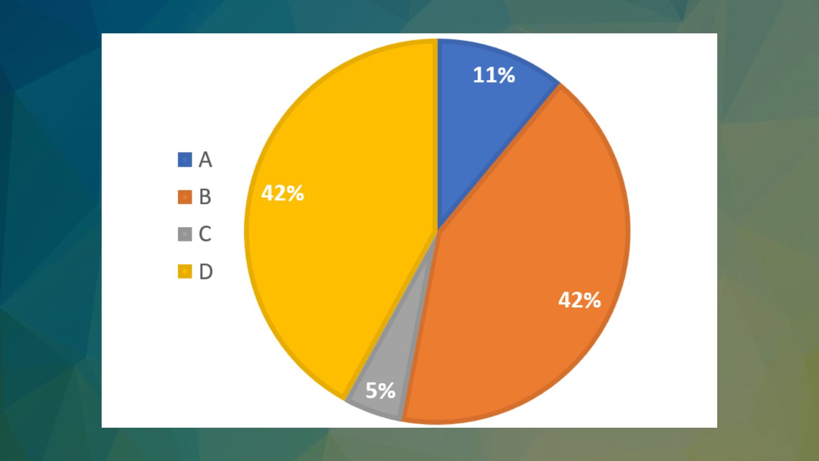
Use visualizations that accurately represent the data and avoid using charts or graphs that can be misleading, like the pie chart above.
(Here is another perspective for the chart above)
2/7
2. Don't be selective.
Avoid selectively presenting only certain parts of the data to support a preconceived conclusion.
Always present the data entirely and in a way that is easily understandable.
3/7
Avoid selectively presenting only certain parts of the data to support a preconceived conclusion.
Always present the data entirely and in a way that is easily understandable.
3/7
3. Be transparent about the data:
Be clear about these:
- Data source
- Data limitations
- Data pre-processing or cleaning
4/7
Be clear about these:
- Data source
- Data limitations
- Data pre-processing or cleaning
4/7
4. Consider the potential impact.
Make sure that the data is not discriminative or harms individuals or groups.
For example, if data is used to make decisions about hiring, ensure that the data is not discriminative against certain people.
5/7
Make sure that the data is not discriminative or harms individuals or groups.
For example, if data is used to make decisions about hiring, ensure that the data is not discriminative against certain people.
5/7
5. Provide context.
- Background information
- Explanations of business terms
For example, if you are presenting data on GDP, provide information about the current state of the economy and other factors that has an impact on the data.
6/7
- Background information
- Explanations of business terms
For example, if you are presenting data on GDP, provide information about the current state of the economy and other factors that has an impact on the data.
6/7
That's it for today.
I hope you've found this thread helpful.
Like/Retweet the first tweet below for support and follow @levikul09 for more Data Science threads.
Thanks 😉
7/7
I hope you've found this thread helpful.
Like/Retweet the first tweet below for support and follow @levikul09 for more Data Science threads.
Thanks 😉
7/7
Mentions
See All
Akshay 🚀 @akshay_pachaar
·
Jan 24, 2023
Great thread Levi! 👏