Thread
Here’s how to double conversion on your startup’s homepage.
(From rewriting over 1,000 websites.)
A thread 👇
(From rewriting over 1,000 websites.)
A thread 👇
1/ Your "above the fold" (ATF) section is the part of your site that's immediately visible before scrolling.
When visitors see this, they decide to either keep scrolling or bounce.
In seconds, they attempt to assess:
• What you do.
• Whether you're a fit for them.
When visitors see this, they decide to either keep scrolling or bounce.
In seconds, they attempt to assess:
• What you do.
• Whether you're a fit for them.
2/ If your ATF is confusing or uninteresting, visitors bounce.
This happens because of:
1. Weak messaging: Your product's purpose is unclear, uninteresting, or irrelevant.
2. Weak design: Your design is unprofessional or outdated.
This happens because of:
1. Weak messaging: Your product's purpose is unclear, uninteresting, or irrelevant.
2. Weak design: Your design is unprofessional or outdated.
3/ There are 3 things you can change on your ATF.
1. Header
2. Subheader
3. Design
Let's dive into each.
1. Header
2. Subheader
3. Design
Let's dive into each.
4/ Headers need to:
1. Identify how users get value from your product.
2. Include a hook—to get them to keep reading.
3. Speak directly to your customer personas.
1. Identify how users get value from your product.
2. Include a hook—to get them to keep reading.
3. Speak directly to your customer personas.
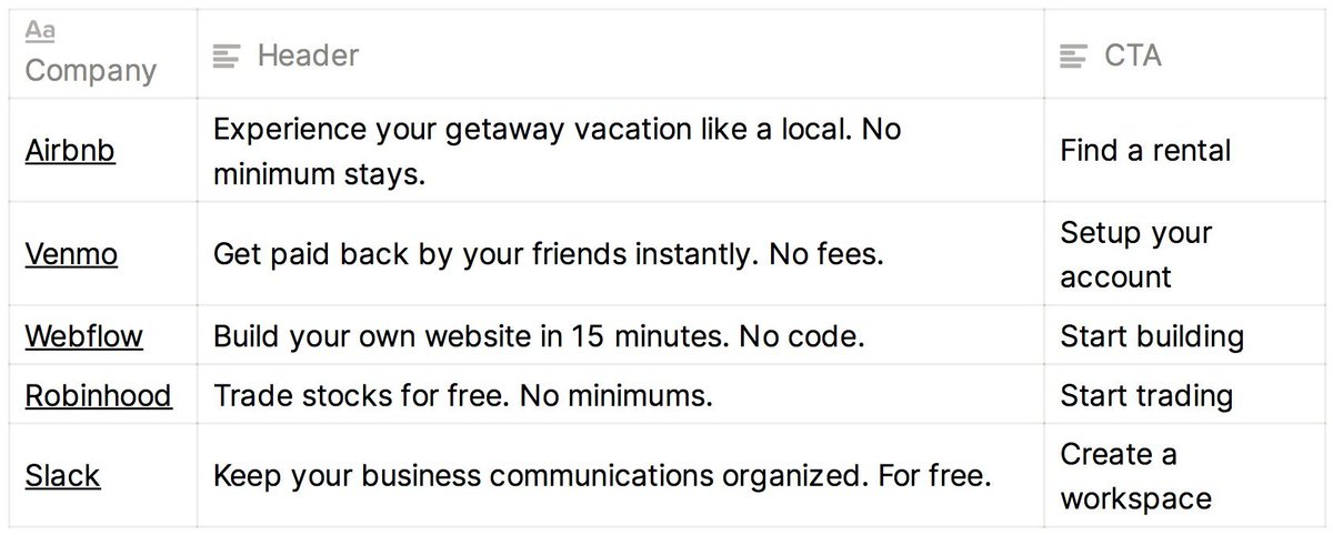
5/ To express value, sharpen your value prop:
1. What bad alternative do people resort to when they lack your product?
2. How is your product better than the bad alternative?
3. Now turn the last step into an action statement—that's your value prop
Examples from top startups: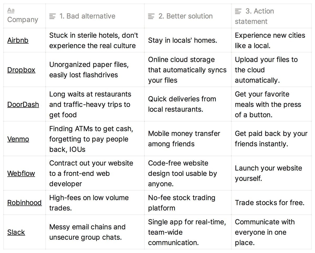
1. What bad alternative do people resort to when they lack your product?
2. How is your product better than the bad alternative?
3. Now turn the last step into an action statement—that's your value prop
Examples from top startups:

6/ Then add a hook:
1. Either a bold claim: Something highly specific that triggers the thought, "Wow, I didn't know that was possible." (Example on left.)
2. Or address likely objections. (Examples on right.)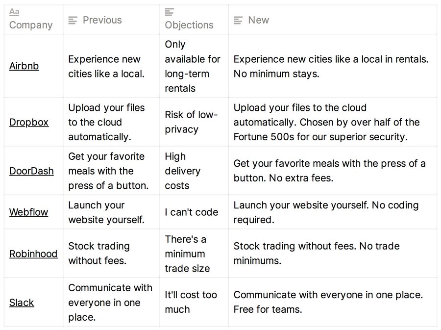
1. Either a bold claim: Something highly specific that triggers the thought, "Wow, I didn't know that was possible." (Example on left.)
2. Or address likely objections. (Examples on right.)

7/ Address your value prop to the right audience.
• List out your top 2-3 customer personas.
• Rewrite your headers to speak to them—in their language.
• Choose the header that best addresses your key audience, or create a landing page for each persona.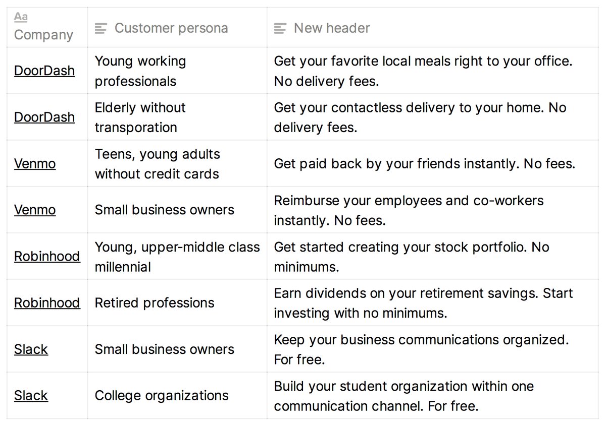
• List out your top 2-3 customer personas.
• Rewrite your headers to speak to them—in their language.
• Choose the header that best addresses your key audience, or create a landing page for each persona.

8/ Now add a subheader. Your subheader should expand on two things:
1. How does our product work *exactly*?
2. Which of our features make our header's bold claim believable?
1. How does our product work *exactly*?
2. Which of our features make our header's bold claim believable?
9/ Here's how you do it:
• Rewrite your subheader to explain how the claim in your header is achieved.
• Add the top 2-3 features of your product.
• Keep it brief. Lengthy paragraphs kill momentum.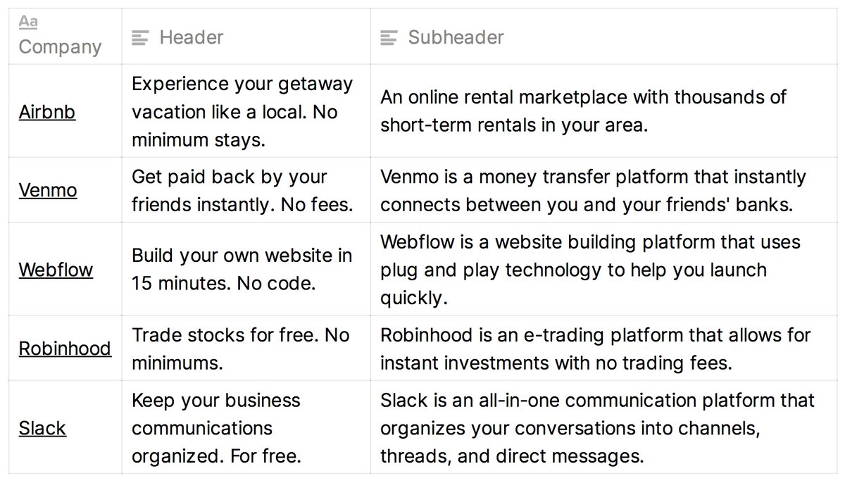
• Rewrite your subheader to explain how the claim in your header is achieved.
• Add the top 2-3 features of your product.
• Keep it brief. Lengthy paragraphs kill momentum.

10/ Design
A landing page's design should rarely be unique. It's your product that should be unique.
Your page is just a familiar medium for communicating your product's uniqueness.
A landing page's design should rarely be unique. It's your product that should be unique.
Your page is just a familiar medium for communicating your product's uniqueness.
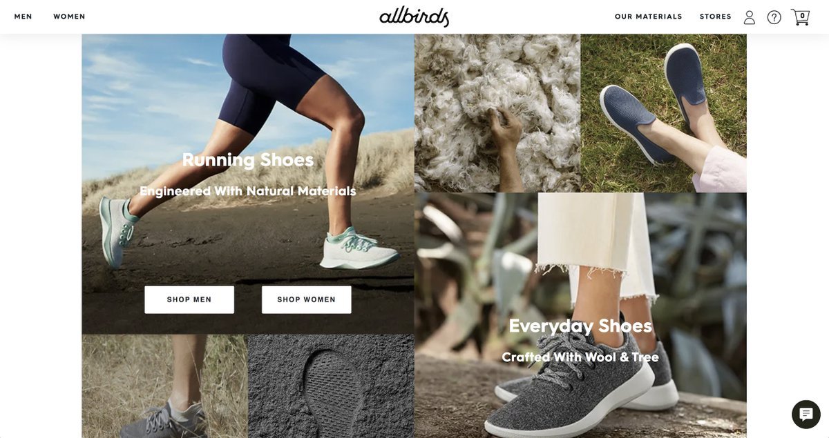
11/ Images
Consider these goals when adding images:
• Remove uncertainty by showing the product in action. (Hellosign uses a GIF to show the product.)
• If you sell physical goods, 1) show off the various use cases and 2) show close-ups of the build quality (e.g. Allbirds)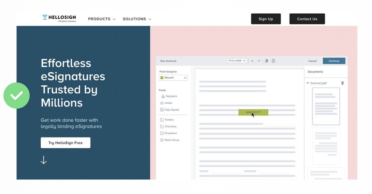
Consider these goals when adding images:
• Remove uncertainty by showing the product in action. (Hellosign uses a GIF to show the product.)
• If you sell physical goods, 1) show off the various use cases and 2) show close-ups of the build quality (e.g. Allbirds)


12/ CTAs
CTAs should be continuations of the magic teased in the header copy.
It feels natural to click these CTAs because they help the visitor continue the narrative you kicked off.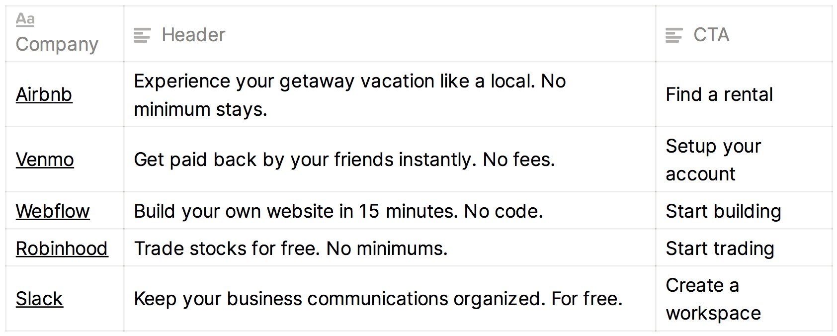
CTAs should be continuations of the magic teased in the header copy.
It feels natural to click these CTAs because they help the visitor continue the narrative you kicked off.
13/ Recap:
• Your header identifies how users get value from your product.
• Add a hook: Bold claims or objection handling.
• Subheader explains *how* your product works.
• Design should support your message: value-add images, minimal navbars, and magic-relevant CTA buttons.
• Your header identifies how users get value from your product.
• Add a hook: Bold claims or objection handling.
• Subheader explains *how* your product works.
• Design should support your message: value-add images, minimal navbars, and magic-relevant CTA buttons.
I hope you've found this thread helpful.
Follow me @NealOGrady for more about startup growth.
Like/Retweet the first tweet below if you can:
Follow me @NealOGrady for more about startup growth.
Like/Retweet the first tweet below if you can: