Thread
Artist here with some thoughts on the amazing JWST images. There’s a lot going on in these images that prompt us non-astronomers to be affected by them in ways that are both particular and powerful.
A thread… ⤵️
A thread… ⤵️
First of all, images don’t exist in a vacuum - we experience them partly through what we have been told about them. E.g. if we’ve been told the Mona Lisa is one of the most important artworks in history, we’re inclined to approach it with deference - to “see” it differently.
In the case of JWST, we’re told we’re seeing the furthest reaches of the universe and the deepest depths of time. Thus, we approach the images expecting to see an eternal, timeless, TRUTH. This is a very powerful aesthetic prompt – one that we *feel* as much as cognize.
It’s powerful stuff. It’s a strategy that religious art and architecture rely on. 

But there’s more. The aesthetic language of the JWST images also tell a story. They do this by using formal tropes that your mind subconsciously associates with related images.
Some background: colors in the JWST images aren’t “real.” The telescope collects photons in wavelengths mostly outside what we perceive as visual light. This is good because a lot of the structures in deep space reflect- and emit- light outside visible wavelengths.
But it means that someone has to “translate” those non-visual wavelengths into visible light so we can see the JWST data as “photographs.” The person in charge of this at NASA is named Joe DePasquale. Their work is profiled here: www.youtube.com/watch?v=ZT68KjxYQ4g
NASA has a guide for doing those transformations. It’s called the “Hubble Pallet.” The Hubble Pallet says that Sulphur II emissions should be red, Hydrogen-alpha should be green, and Oxygen III should be blue. JWST appears to use a similar if not identical pallet.
There’s nothing “natural” about this pallet. It was created by NASA to give the Hubble images their own “look” and to create a specific genre of “Hubble Photos.”
Amateur astronomers have created all sorts of pallets with different “looks” and they’re all valid from a technical perspective. Thanks to @erfmufn, you can explore alternatives to the Hubble pallet at www.bintel.com.au/narrowband-preview-tool/
So where do Hubble and JWST’s aesthetic conventions come from? Why these colors? We now return back to the world of aesthetics and how the “meaning” of images comes from conscious and subconscious external information.
Elizabeth Kessler, an art historian at Stanford, points out that the Hubble Pallet is very similar to the visual language of 19th Century paintings of the American West, particularly those by Albert Bierstadt and Thomas Moran. Here book is here: www.upress.umn.edu/book-division/books/picturing-the-cosmos
The compositions are also similar... 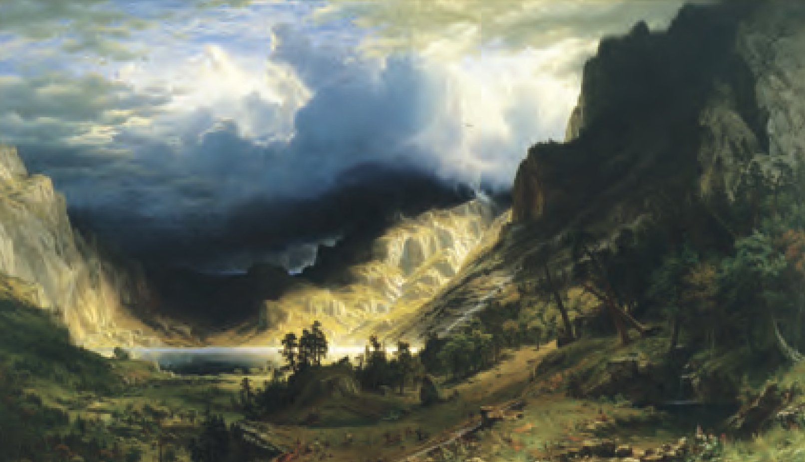


The color pallet and compositions in the JWST images make an implicit argument we understand subconsciously: that looking at the depths of the cosmos is akin to looking into the 19th Century American frontier. Aesthetically, they tap into some intense American self-mythologizing.
Don’t get me wrong, I’m super excited about the JWST images and have spent a ton of time poring over them. They’re truly incredible.
But I thought I’d pick them apart a little and try to show some of the strings they’re pulling on in our cultural unconscious and the role that aesthetics and art history play in how we look at them.
Images don’t “mean” anything in- and of- themselves. The “meaning” of images is always relational, unstable, contextual, historical, and very often political, even and perhaps especially when we don't consciously perceive them as such.