Thread
Interesting to see how the @nytgraphics has changed their map symbology as the Russian war in #Ukraine️ unfolds. On Feb 26, large red arrows and an almost opaque red color shows Russian advances in Ukraine. Suggesting fast, large and controlled overtaking. 1/5 

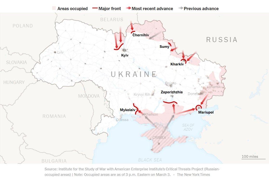
By march 3rd, the arrows are considerably smaller, and the occupied areas are shown in a more transparent red color. Suggesting more complexity in the reality on the ground. Still, Ukrainian forces appear non-existent on the map. 2/5 
By march 7th, the NYT's maps now show for the first time the Ukrainian forces in blue. Russian forces are given a slightly more pink tone. Occupied areas are rendered with more transparency than before, but cities under Russian control are now labeled in red. 3/5 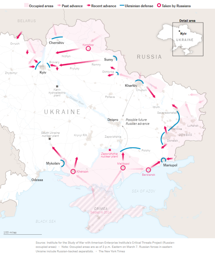

By March 21st, Ukraine's presence in the map is increased by showing all large cities under Ukrainian control in blue. The 'Russian occupied areas' previously shown in red are no longer shown on the map. 4/5 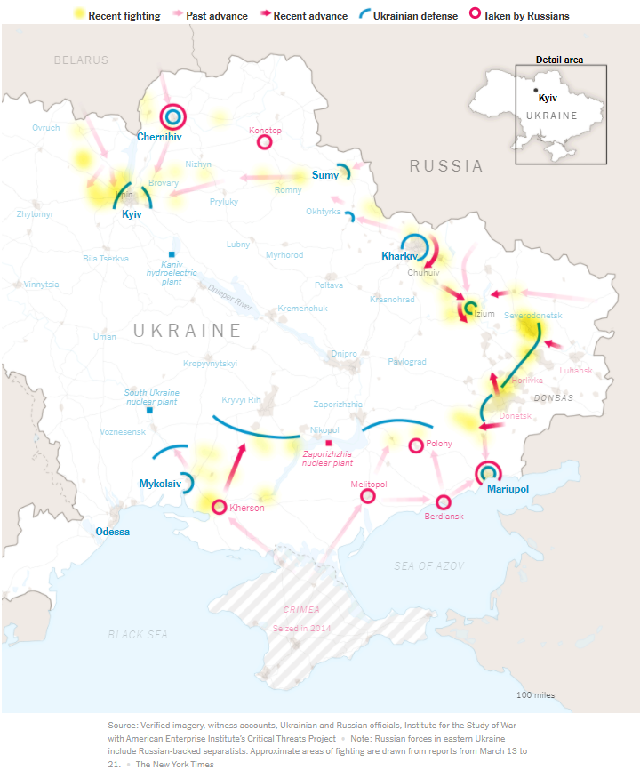

Curious to know from @nytgraphics how much of these changes in visualization are simply due to strong Ukraine forces, or because there is an increased recognition that different cartographies can significantly change how one understands the war? 5/5