Thread by Kareem Carr | Data Scientist
Thread
I know a lot of you wanted a technical breakdown of this meme so here it is!
I don't think you will find this level of detail anywhere else so keep reading if you don't want to miss out.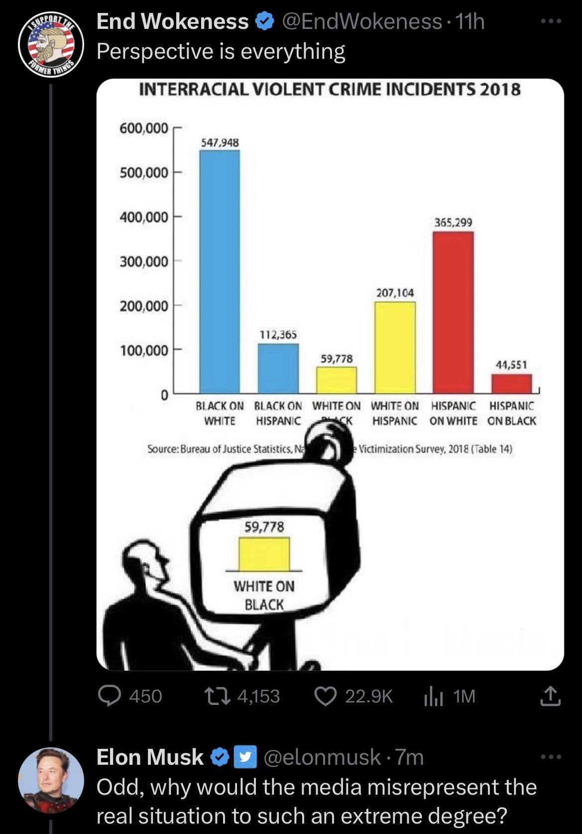
I don't think you will find this level of detail anywhere else so keep reading if you don't want to miss out.

MISLEADING FORMAT:
The first thing I did was recreate the bar chart. I wanted to make sure that my calculations matched theirs since they seem to have modified the data reported in the original source.
The first thing I did was recreate the bar chart. I wanted to make sure that my calculations matched theirs since they seem to have modified the data reported in the original source.

The original table had percentages and those seem to have been used to reverse engineer the numbers in the bar chart. 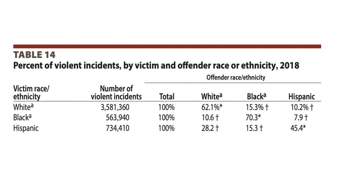

Small nitpick. Since the percentages are only reported to 3 significant figures, the original bar chart should display numbers to three significant figures as well: 112,000. vs 112,365
It's minor but contributes to the overall sense of the chart as misleading.
It's minor but contributes to the overall sense of the chart as misleading.
In my opinion, the original table is vastly superior to the bar chart.
It communicates clearly the fact that the rates at which white victims experience violent crime involving black offenders is very similar to the overall percentage of black people in the population (14.6%).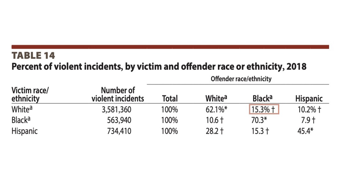
It communicates clearly the fact that the rates at which white victims experience violent crime involving black offenders is very similar to the overall percentage of black people in the population (14.6%).

This point is *actively* obscured by turning these percentages into counts in the graph.
POOR ORGANIZATION OF INFORMATION
This next point is subtle. The original table is victim-centered. It shows the percentage of violent crime experienced by each category of victim as a consequence of other groups.
The bar chart breaks the numbers down by race of the offender.
This next point is subtle. The original table is victim-centered. It shows the percentage of violent crime experienced by each category of victim as a consequence of other groups.
The bar chart breaks the numbers down by race of the offender.
This is particularly misleading because without context it makes it seem as if black offenders are going out of their way to seek out white victims. 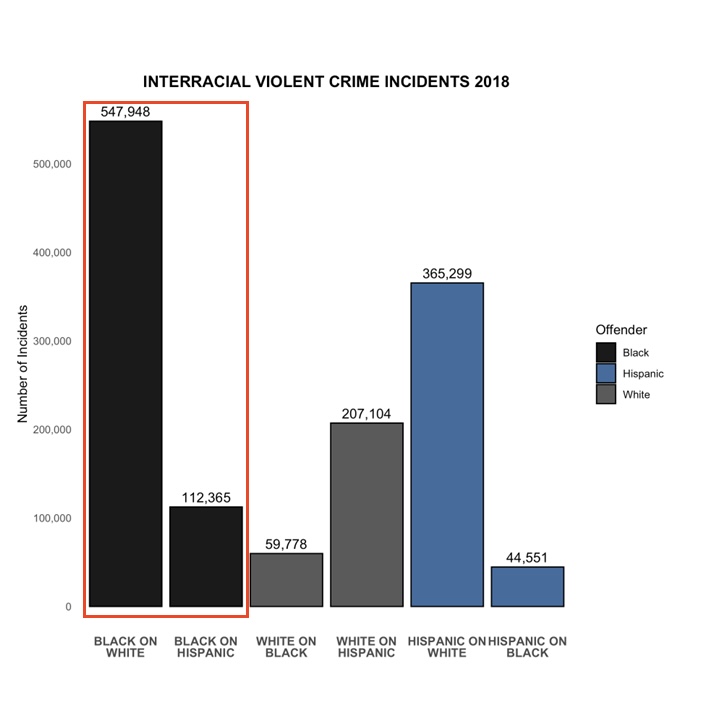

But the overwhelming majority of Americans are white. The implications of this fact are a bit shocking. So let this sink in:
In a truly race-blind society, where most of the people are white and where victims are being selected purely at random, the vast majority of crimes committed by black offenders *should* involve white victims.
This should be our default hypothesis.
This should be our default hypothesis.
MISSING CONTEXT
If we add same-race crime, we see that the vast majority of violent crimes in America involve white victims and white offenders.
If we thought race was a huge factor, and wanted to make the biggest impact on crime numbers, we might want to start there.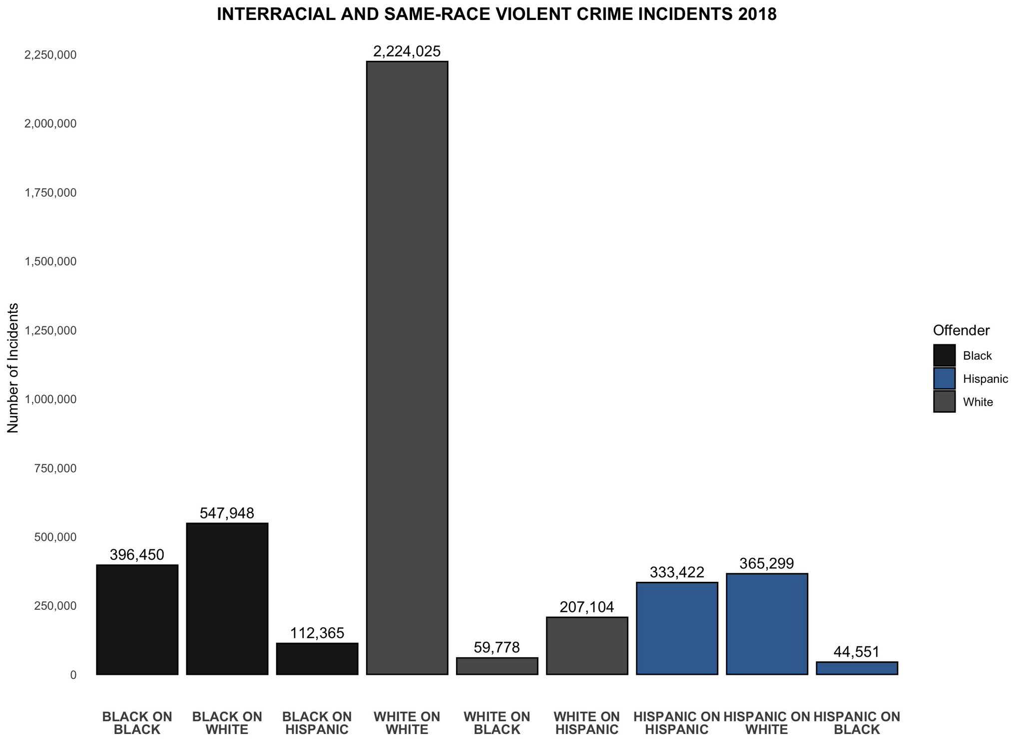
If we add same-race crime, we see that the vast majority of violent crimes in America involve white victims and white offenders.
If we thought race was a huge factor, and wanted to make the biggest impact on crime numbers, we might want to start there.

White offenders cause more violent crime than every other group.
If *you* think race is an important causal factor then we must conclude that reducing the rate at which white people commit violent crime would have the biggest impact not just for white people but America. 🇺🇸 🦅
If *you* think race is an important causal factor then we must conclude that reducing the rate at which white people commit violent crime would have the biggest impact not just for white people but America. 🇺🇸 🦅
UNFAIR COMPARISON DUE TO AGE
According to Pew Research, the most common age of White Americans in 2018 is 58. For Black Americans, it's 27.
As you can imagine, there's probably not a lot of 58 year olds running around committing violent crime.
According to Pew Research, the most common age of White Americans in 2018 is 58. For Black Americans, it's 27.
As you can imagine, there's probably not a lot of 58 year olds running around committing violent crime.

When we compare the white population to the black population without adjustment, we are essentially comparing 58 year olds to 27 year olds.
This is *not* a fair comparison.
This is *not* a fair comparison.
UNFAIR COMPARISON DUE TO WEALTH
It is pretty much common knowledge that Black Americans are much less wealthy than White Americans. When we compare crimes between groups, we are also comparing across wealth and income levels.
Again, this is *not* a fair comparison.
It is pretty much common knowledge that Black Americans are much less wealthy than White Americans. When we compare crimes between groups, we are also comparing across wealth and income levels.
Again, this is *not* a fair comparison.

MISLEADING MEASURE
"Crime" doesn't exist in nature. It is socially constructed by humans.
When comparing social constructs between groups, we have to ask ourselves if the thing we are observing is socially constructed in exactly the same way for both groups.
"Crime" doesn't exist in nature. It is socially constructed by humans.
When comparing social constructs between groups, we have to ask ourselves if the thing we are observing is socially constructed in exactly the same way for both groups.
Do violent crime incidents have *exactly* the same probability of being reported and investigated regardless of race? Do offenders have *exactly* the same probability of being arrested? Do arrestees have *exactly* the same probability of being convicted?
If not, then "violent crime" might not be a good candidate for a comparison measure between groups.
Race can be an emotional topic. So let me explain this with a physical example. I know what I'm saying sounds like a squishy humanities issue but it's actually a 100% rock hard science issue.
Imagine we have two detectors. One detects B particles and the other W particles.
Imagine we have two detectors. One detects B particles and the other W particles.
If the detectors differed in:
1. how long they were powered during the experiment
2. their probabilities of picking up a particle while active
3. their error rates for logging those particles once detected
1. how long they were powered during the experiment
2. their probabilities of picking up a particle while active
3. their error rates for logging those particles once detected
Would it make sense to use the counts from the W and B detectors as a way of comparing the abundance of each particle?
We might still follow the counts from a single detector over time and therefore get a sense of increasing and decreasing trends in the number of particles, but the absolute numbers coming out of the detectors might not be very meaningful.
SIDE NOTE: I speak from experience. My research involves gene expression which is very tricky to measure. The "detectors" vary significantly. Therefore, raw measurements don't mean much without context, but trends can tell you a lot about when and to what degree genes are active.
SUMMARY:
This is a bad use of data.
- misleading format
- poor organization
- missing context
- confounding by age, income and probably many other factors
- naive use of a poor outcome measure (violent crime)
This is a bad use of data.
- misleading format
- poor organization
- missing context
- confounding by age, income and probably many other factors
- naive use of a poor outcome measure (violent crime)

If you like the thread then follow me for more content like this, and don't forget to click the little notification bell so you don't miss out on future threads.