Thread
Why you will fail miserably as an NFT project founder if you don't understand how your brand evokes emotion
🟦🟥🟨
🧵 (BAYC, Azuki, Pudgies all use this!)
🟦🟥🟨
🧵 (BAYC, Azuki, Pudgies all use this!)

Brands that use EMOTION to their advantage are the ones that attract superfans like the die hard supporters of BAYC, Azuki, DeGods/y00ts, Sappy Seals, and Pudgies.
So how do they do it?👇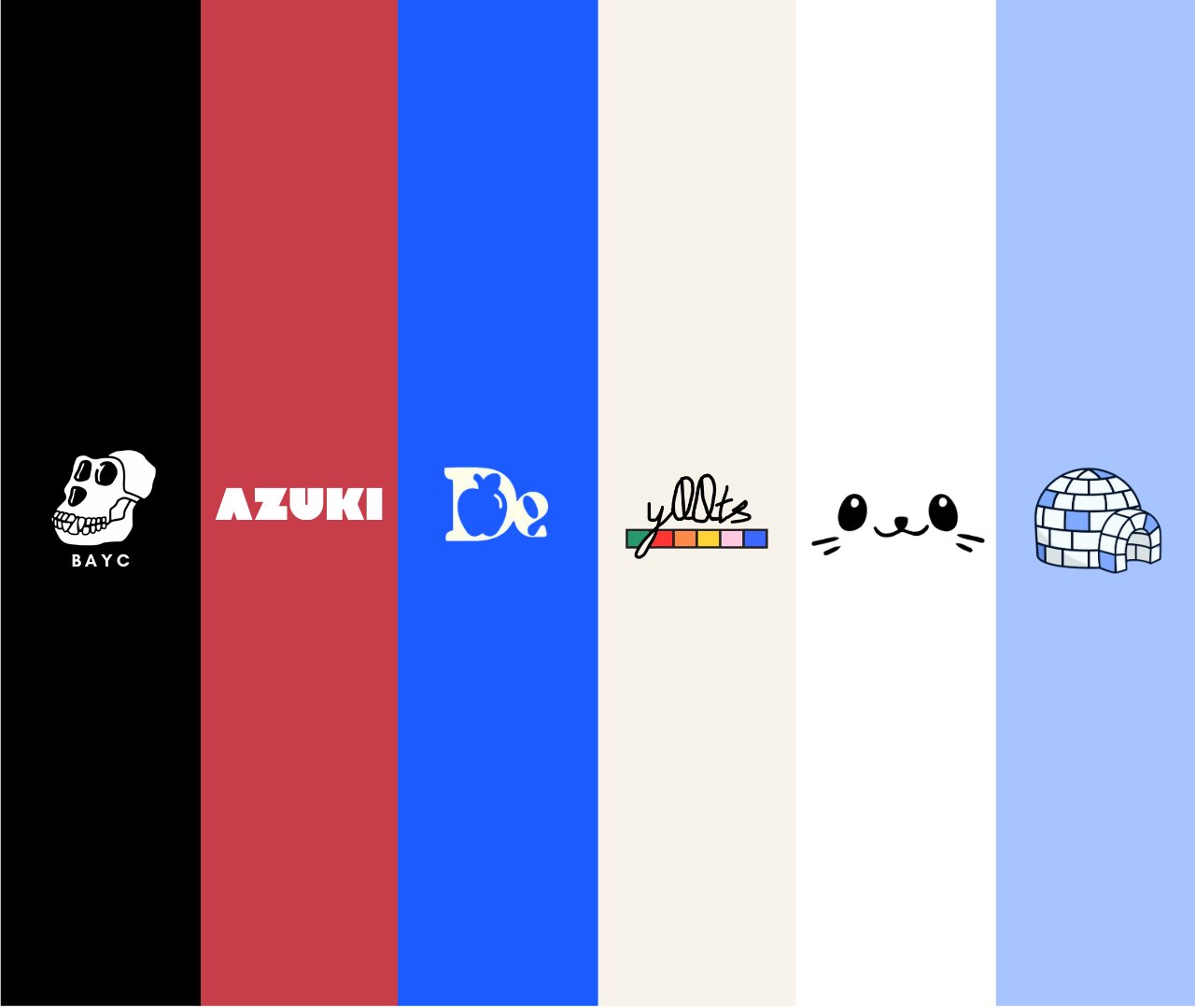
So how do they do it?👇

There are 3 fascinating ways that your brand can evoke emotion:
1/ Following the unwritten rules of Kiki and Bouba📜
2/ Music 🎶
3/ Colors 🟦🟥🟨
1/ Following the unwritten rules of Kiki and Bouba📜
2/ Music 🎶
3/ Colors 🟦🟥🟨


There are a few unwritten rules about design that everyone agrees upon BUT that no one says.
So let's talk about them:👇
So let's talk about them:👇
1/ Kiki and Bouba:
In the image below, one of the shapes is named Kiki and the other named Bouba. We ALL know exactly which is which without being told. Some things about branding are INSTINCTUAL.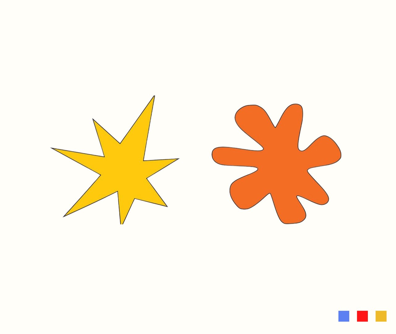
In the image below, one of the shapes is named Kiki and the other named Bouba. We ALL know exactly which is which without being told. Some things about branding are INSTINCTUAL.

2/ Following Kiki
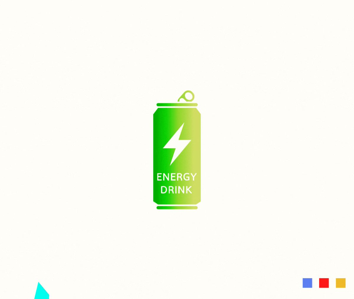
So if your brand is an energy drink and is more like Kiki, your branding should be more Kiki than Bouba: sharp, colorful, and edgy.
So if your brand is an energy drink and is more like Kiki, your branding should be more Kiki than Bouba: sharp, colorful, and edgy.
3/ Following Bouba
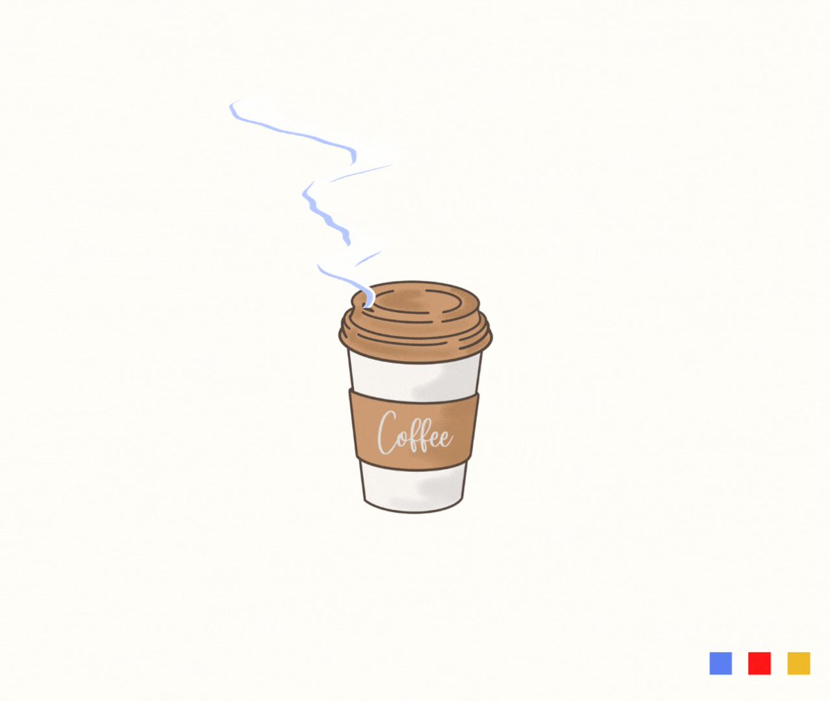
So if your brand is hot coffee and is more like Bouba, your branding should be more Bouba than Kiki: rounded edges, soft, calming, and warm.
So if your brand is hot coffee and is more like Bouba, your branding should be more Bouba than Kiki: rounded edges, soft, calming, and warm.
So how does this relates to NFT projects?👇
4/ @Azuki
Azuki is clearly Kiki and ALL of their branding feels that way. The NFTs have sharp hair, strong colors, and jagged lines. Even the name "Azuki" sounds Kiki!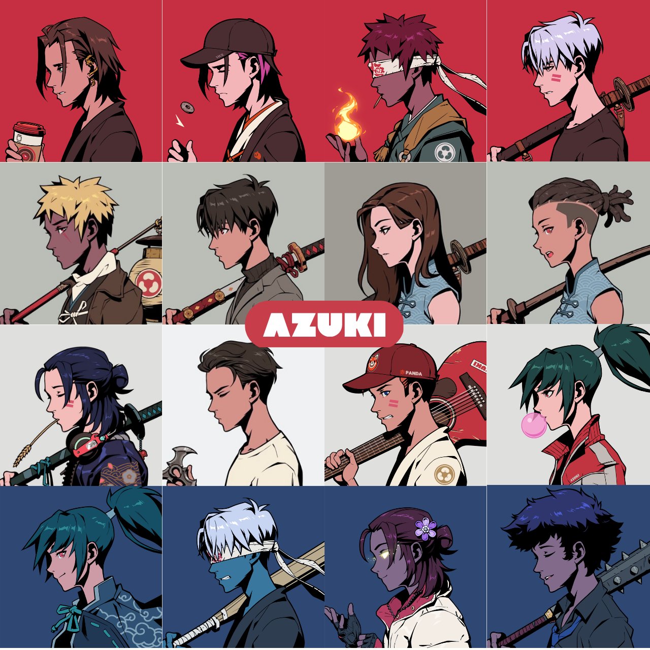
Azuki is clearly Kiki and ALL of their branding feels that way. The NFTs have sharp hair, strong colors, and jagged lines. Even the name "Azuki" sounds Kiki!

The shadows are deep, the clothes have wrinkles, and even the smoke in their website animation moves sharply. If your brand is Kiki, your ENTIRE brand needs to be Kiki or it will feel disjointed.
5/ y00ts
y00ts is clearly Bouba and ALL of their branding feels that way. The NFTs have soft fur, faded colors, and rounded lines. Even the name "y00ts" sounds Bouba!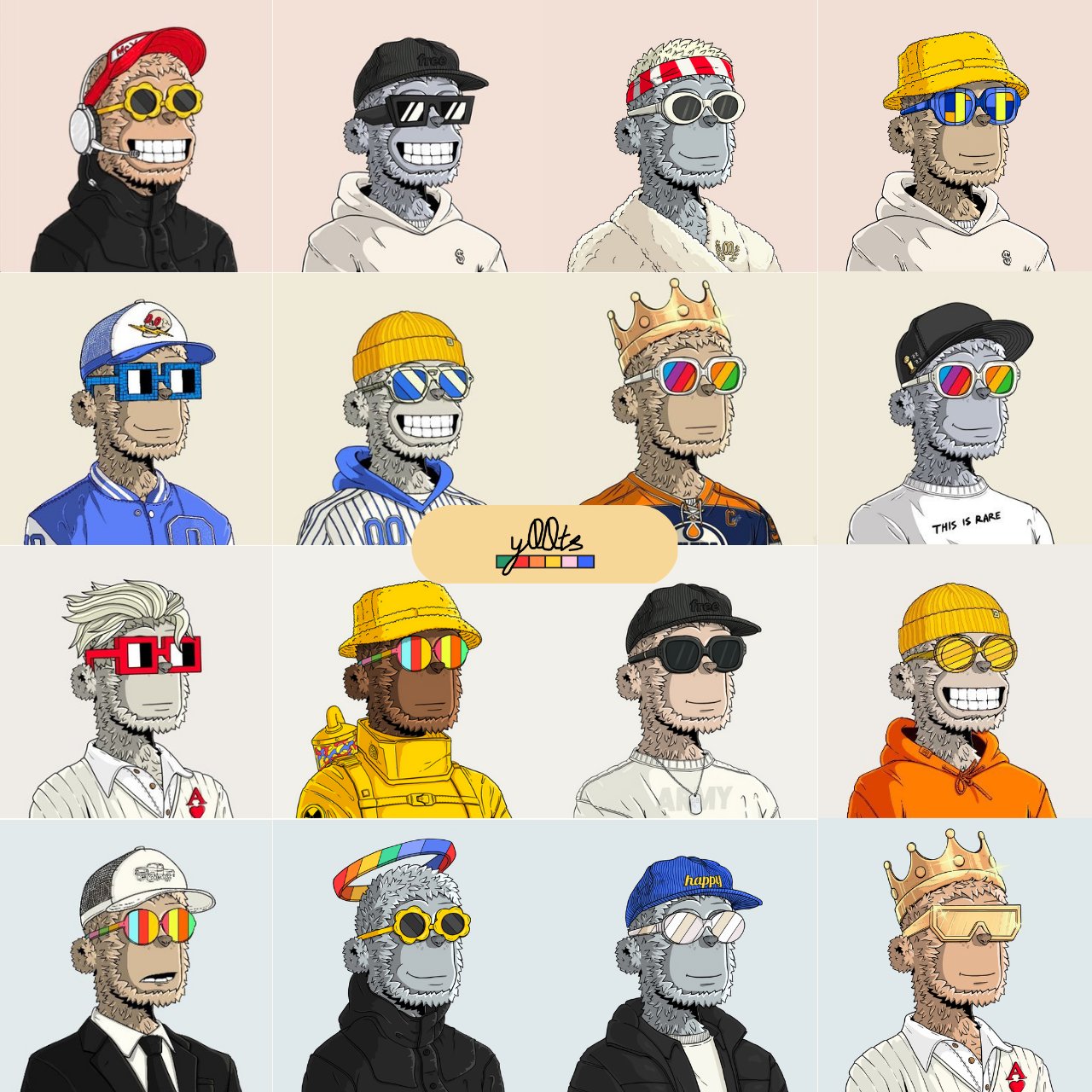
y00ts is clearly Bouba and ALL of their branding feels that way. The NFTs have soft fur, faded colors, and rounded lines. Even the name "y00ts" sounds Bouba!

Again, if your brand is Bouba, your ENTIRE brand needs to follow Bouba or it will feel disjointed. 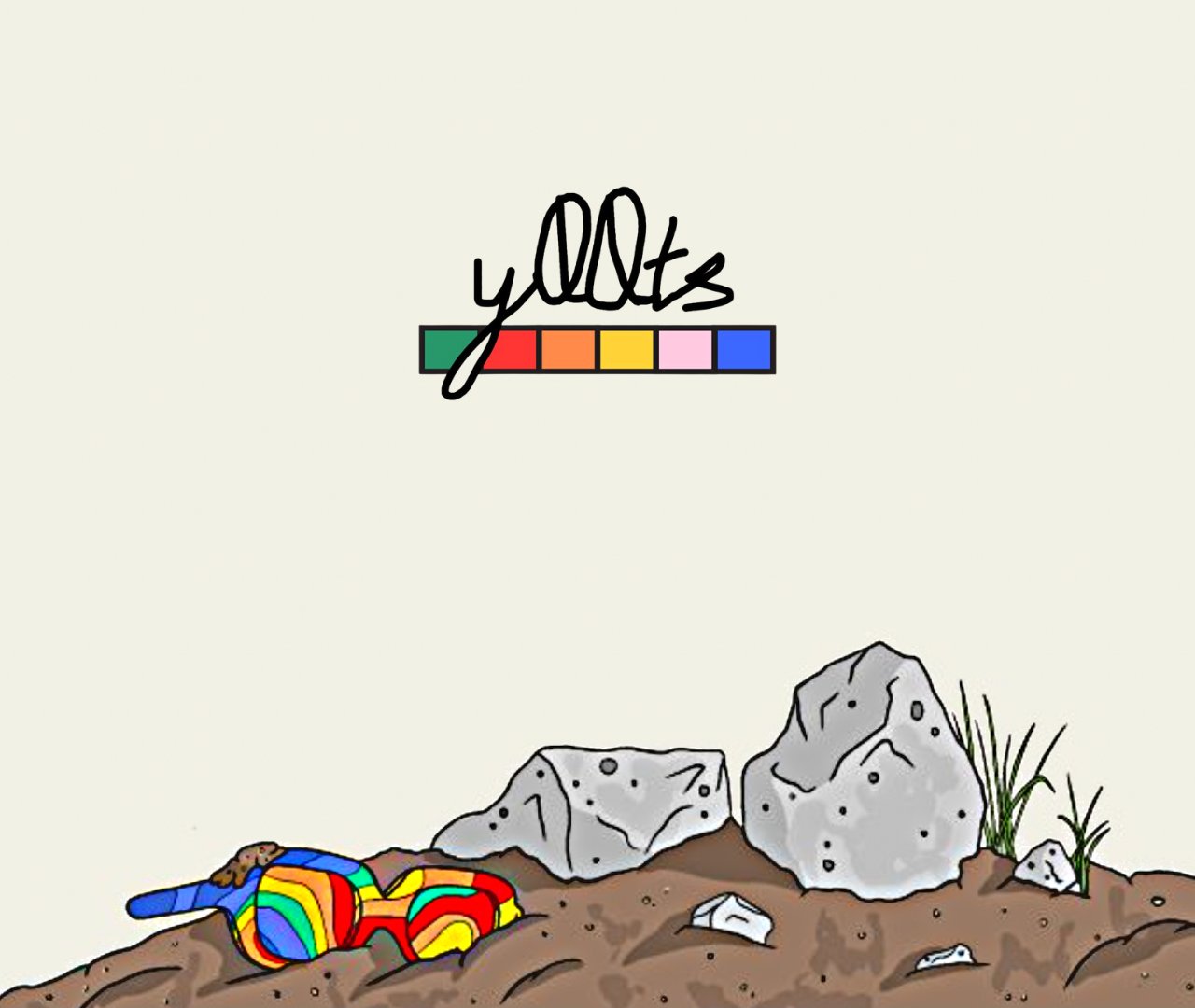


Music IS the vibe! Music sets the tone for your brand. You can use it to evoke excitement, portray a vibe, or cue a mood. Here are a few examples👇
1/ Mad Lads
@MadLadsNFT uses a hard rock track here. When you watch it, be mindful of the mood it puts you in.
You're ready to headbang at a Kiss concert! With a simple song choice they tell the project is high energy, tough, metal, and they ingratiate you into the community.
@MadLadsNFT uses a hard rock track here. When you watch it, be mindful of the mood it puts you in.
You're ready to headbang at a Kiss concert! With a simple song choice they tell the project is high energy, tough, metal, and they ingratiate you into the community.
2/ Sports Meta
We used a high energy, new wave hip hop beat. We want you to feel like you're slow-mo walking through the streets of Havana on a cool summers day because that is our VIBE. @TheSportsMeta
We used a high energy, new wave hip hop beat. We want you to feel like you're slow-mo walking through the streets of Havana on a cool summers day because that is our VIBE. @TheSportsMeta
Your community needs direction and music tells them which way to face. This is IMPORTANT.

The colors you choose, allow you to complete the trifecta of emotion.
You can evoke sadness, morose, joy, excitement, a feeling of freshness, and even smells!
Here are a few examples of projects that do this well👇
You can evoke sadness, morose, joy, excitement, a feeling of freshness, and even smells!
Here are a few examples of projects that do this well👇
1/ Project Ether
Below, Ether decides to use dark saturated oranges, browns, and greys.
It makes you feel charged and powerful and it MATCHES the message perfectly.
Color scheme and message alignment is how you get people to say "it feels right."
Below, Ether decides to use dark saturated oranges, browns, and greys.
It makes you feel charged and powerful and it MATCHES the message perfectly.
Color scheme and message alignment is how you get people to say "it feels right."
Here, the brighter faded purple and red give a feeling of adventure and inquisition. The brand is pulling you in and inviting you on a journey.
If the color scheme of these two images were reversed it would never work.
If the color scheme of these two images were reversed it would never work.
2/ Azuki Again
In the image below, the colors are light and we're looking directly into the bright blue sky.
All of the sudden you feel like you're out on a summer day without a care in the world.
This translates into how you feel about the BRAND.
In the image below, the colors are light and we're looking directly into the bright blue sky.
All of the sudden you feel like you're out on a summer day without a care in the world.
This translates into how you feel about the BRAND.
If you learned something new and want to learn more give me a follow @LoopxNFT and drop a comment, like, and RT the first tweet!
Key points to using emotion to attract TRUE fans:
1/ Some branding is instinctual, follow Kiki and Bouba⚡️🔵
2/ Use music to SET THE TONE 🎶
3/ Use colors to SET THE MOOD 🟦🟥🟨
Love you all,
Loop
1/ Some branding is instinctual, follow Kiki and Bouba⚡️🔵
2/ Use music to SET THE TONE 🎶
3/ Use colors to SET THE MOOD 🟦🟥🟨
Love you all,
Loop

Mentions
See All
Its Erik @ErikOnChain
·
Apr 26, 2023
10/10 thread sir, super insightful stuff 😤
Loki The Bird @lokithebird
·
Apr 26, 2023
Nice thread , thanks