Thread
A good old $BTC thread, let’s go
🔵#Bitcoin cycles
🔵Capitulation
🔵A new phase
🔵HODL
🔵Momentum
🔵Wallets & demand
🔵Conclusion
TLDR; It’s only the start of a fresh Bull Market, imho
Let’s dive in 1/38 🧵
🔵#Bitcoin cycles
🔵Capitulation
🔵A new phase
🔵HODL
🔵Momentum
🔵Wallets & demand
🔵Conclusion
TLDR; It’s only the start of a fresh Bull Market, imho
Let’s dive in 1/38 🧵

2/ First of all: in the end, all you read here is just my 2 cents. Please DYOR, NFA etc etc
Ok, let’s go
If you follow me for a while, you know that I think the Bear Market finished in Nov ‘22.
I think we did hit a bottom after the FTX drama
Ok, let’s go
If you follow me for a while, you know that I think the Bear Market finished in Nov ‘22.
I think we did hit a bottom after the FTX drama

3/ The FTX drama was the last nail in the coffin, after all the dramatic and capitulation events which had already happened throughout 2022.
Imo, a classical Bear market ended after 1Y in November ‘22.
Imo, a classical Bear market ended after 1Y in November ‘22.

4/ Bear Markets consist of almost constant downwards pressure, followed by one or more capitulation events/moments.
In my opinion, there were 3 nasty events that gave a true capitulation candle.
Of course, capitulation is expected at the bottom, but it was a hard year innit?
In my opinion, there were 3 nasty events that gave a true capitulation candle.
Of course, capitulation is expected at the bottom, but it was a hard year innit?
5/ Capitulation events throughout 2022
The Luna collapse in May
The 3AC & those connected collapse in June
The FTX collapse
Yeah well, for those who lived through it: I’m proud at ya
Those new and need explanation… Well brev: Try Google
The Luna collapse in May
The 3AC & those connected collapse in June
The FTX collapse
Yeah well, for those who lived through it: I’m proud at ya
Those new and need explanation… Well brev: Try Google

6/ I’d like to back my thesis with some trend indicators first.
A few weeks back, we finally had a Bullish Cross of the 100/200 EMA again. A strong signal that can support the thesis more
I wrote another thread (the threadooor) about it:
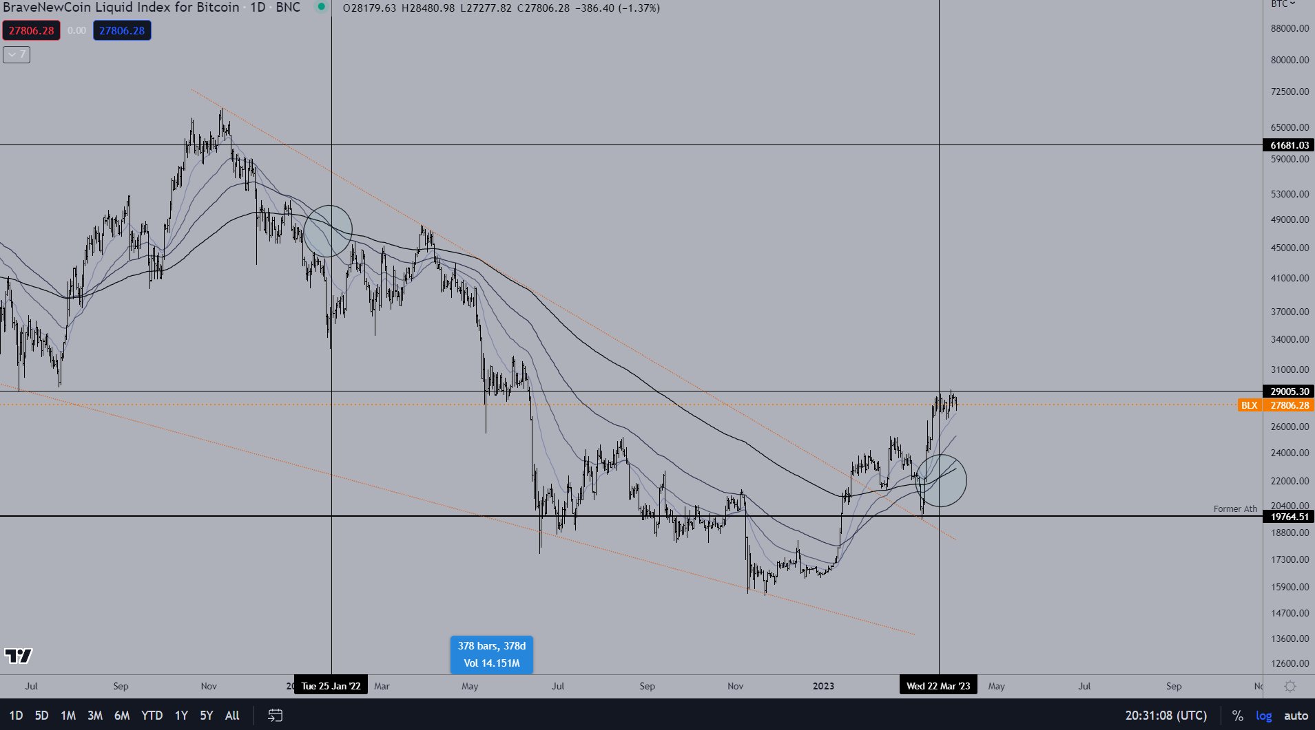
A few weeks back, we finally had a Bullish Cross of the 100/200 EMA again. A strong signal that can support the thesis more
I wrote another thread (the threadooor) about it:

7/ In January, the first signs were already there on the Ichimoku Cloud:
D1 trend changes on the Ichimoku are also very often indicative about what’s to happen next.
Not always of course! We don’t rely on 1 indicator solely
D1 trend changes on the Ichimoku are also very often indicative about what’s to happen next.
Not always of course! We don’t rely on 1 indicator solely
8/ So, in addition:
One particular On-Chain chart with some info also doesn’t say too much, but I’ve found a whole lot more that proves the thesis. Here is why we’re, imho, only in the first phase of the next Bull Market.
I’ll try to explain everything in simple words.
One particular On-Chain chart with some info also doesn’t say too much, but I’ve found a whole lot more that proves the thesis. Here is why we’re, imho, only in the first phase of the next Bull Market.
I’ll try to explain everything in simple words.
9/ It’s like zooming in on a photo:
A few pixels says Jack shit
A bunch can show you something
All of them show you the picture
A few pixels says Jack shit
A bunch can show you something
All of them show you the picture

10/ HODL waves is a great one to start with
It reflects the time a #Bitcoin, or a portion, has not moved. In bunches
When the 0-3 month HODLed supply increases rapidly and gets hot, it’s when old coins turn into new ones, aka distribution, aka plebs buying up from smart money
It reflects the time a #Bitcoin, or a portion, has not moved. In bunches
When the 0-3 month HODLed supply increases rapidly and gets hot, it’s when old coins turn into new ones, aka distribution, aka plebs buying up from smart money

11/ Vice Versa for lows.
I’ve marked 4 massive dips in the % of 0-3 month HODLed supply.
That’s the point where long term investors have strong hands, and most retail isn’t around to buy fresh or less long HODLed #Bitcoin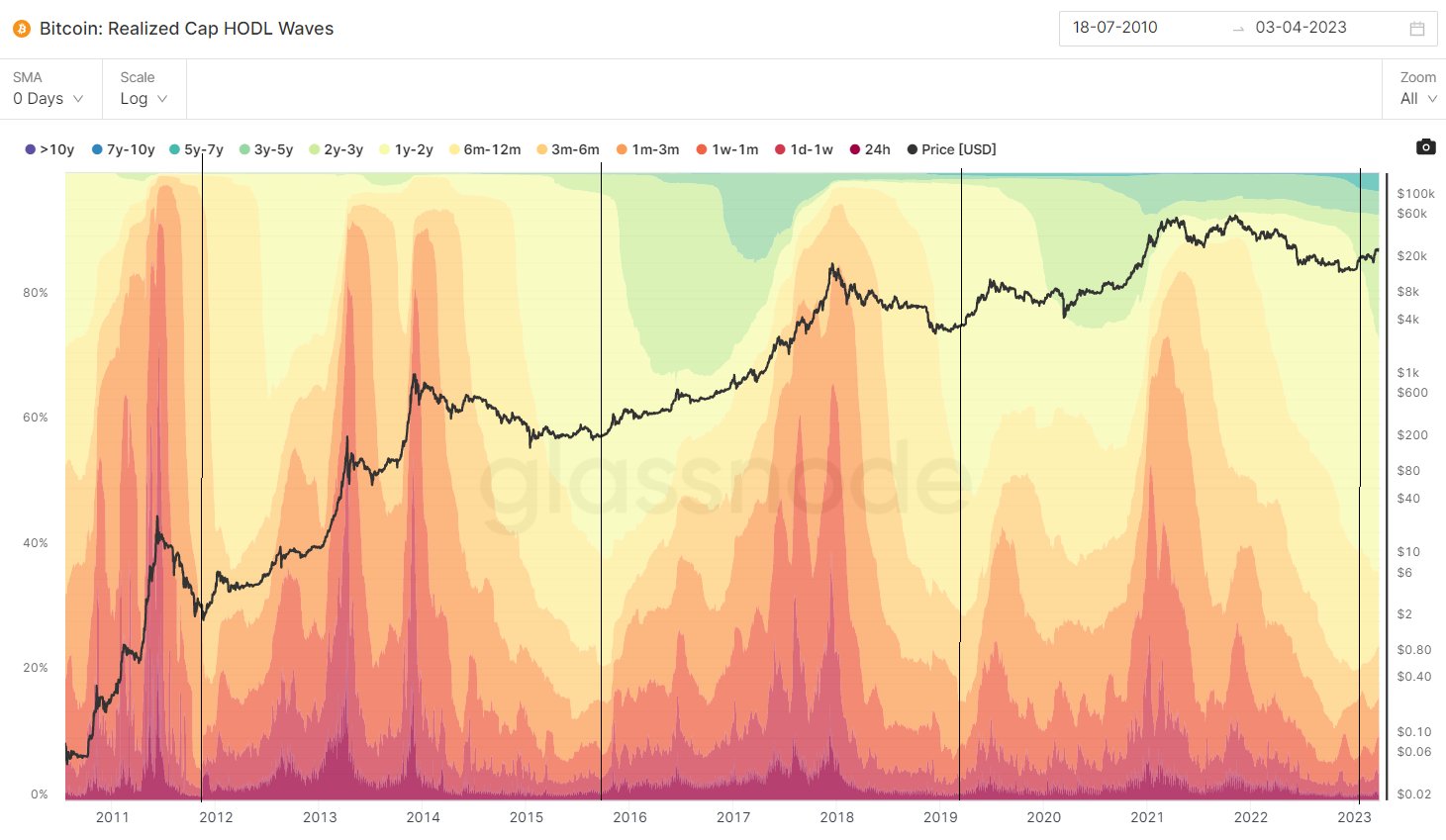
I’ve marked 4 massive dips in the % of 0-3 month HODLed supply.
That’s the point where long term investors have strong hands, and most retail isn’t around to buy fresh or less long HODLed #Bitcoin

12/ It’s even better visual when you only show the % of the 0-3 month HODLed supply
There is only a little increase yet, so despite a 85% pump from the lows, long term strong hands are hardly taking profits yet, it seems.
There is only a little increase yet, so despite a 85% pump from the lows, long term strong hands are hardly taking profits yet, it seems.

13/ If you have a look at the opposite hands: The 3m-10Y+ HODLed supply it clearly shows distribution phases
Distribution is happening when their % of the supply is increasingly shrinking fast.
Bull Market tops seem to appear when they own 25% or less. They now still own 80%+!
Distribution is happening when their % of the supply is increasingly shrinking fast.
Bull Market tops seem to appear when they own 25% or less. They now still own 80%+!

14/ So, the strong HODLing hands are not blinking an eye yet at all.
But let’s go back to the capitulation events again. Big losses must be visible on the charts.
Realized losses: Clean massive spikes during ‘Luna, 3AC & FTX’. Coping bears still ask for Black Swan events…
But let’s go back to the capitulation events again. Big losses must be visible on the charts.
Realized losses: Clean massive spikes during ‘Luna, 3AC & FTX’. Coping bears still ask for Black Swan events…

15/ Over time, as the market cap of #Bitcoin grows, the returns are diminishing.
So are the losses in a Bear market, % wise.
Bear market floor in:
2011: -92%
2015: -85%
2018: -83%
2022: -77%
Makes sense to see them diminishing too, so that’s another argument for a Cycle bottom
So are the losses in a Bear market, % wise.
Bear market floor in:
2011: -92%
2015: -85%
2018: -83%
2022: -77%
Makes sense to see them diminishing too, so that’s another argument for a Cycle bottom

16/ With the MVRV-Z score, you can see if #Bitcoin is over/undervalued, relative to its ‘fair value’
$BTC ‘s market value has been significantly lower than the realized value, for more than half a year.
We’ve only just left the ‘DCA-zone’ slightly.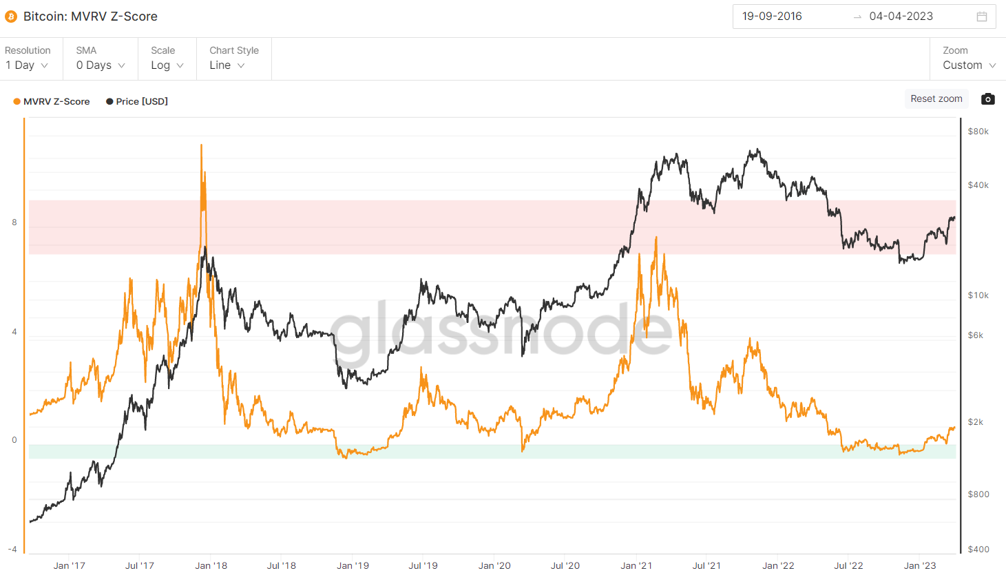
$BTC ‘s market value has been significantly lower than the realized value, for more than half a year.
We’ve only just left the ‘DCA-zone’ slightly.

17/ MVRV Ratio is a slightly different indicator, but it coincides with the previous one.
The MVRV Ratio kinda shows you the extremes. Something like an RSI pointing out extreme overbought/oversold levels.
So here also: We’ve been in a BTFD zone for months and only just left it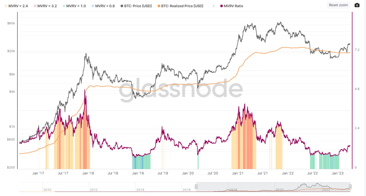
The MVRV Ratio kinda shows you the extremes. Something like an RSI pointing out extreme overbought/oversold levels.
So here also: We’ve been in a BTFD zone for months and only just left it

18/ Reserve Risk
Compares the incentive to sell, to the HODLers who resisted the temptation to sell.
The higher the black line goes, the bigger the opportunity cost for those still HODLing
Notice that the height of the tops are decreasing, but we’re almost at the bottom still.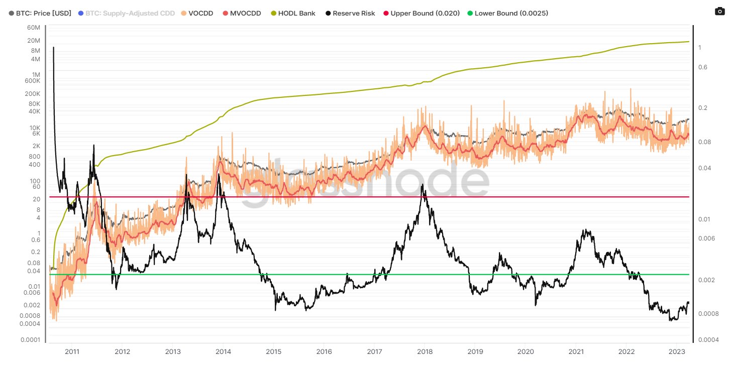
Compares the incentive to sell, to the HODLers who resisted the temptation to sell.
The higher the black line goes, the bigger the opportunity cost for those still HODLing
Notice that the height of the tops are decreasing, but we’re almost at the bottom still.

19/ 140 Day Market Realised Gradient
Give me a moment to explain, lol.
Simply said, it CAN be kind of a momentum fortune teller. Grain of salt added
Red line is the 0-line
Above: Bullish PA/momentum to be expected
Bearish PA below
IN GENERAL, let’s continue
Give me a moment to explain, lol.
Simply said, it CAN be kind of a momentum fortune teller. Grain of salt added
Red line is the 0-line
Above: Bullish PA/momentum to be expected
Bearish PA below
IN GENERAL, let’s continue

20/
140 Day: means that in general, the up or downtrend will probably last around 140 days
Increasing successive peaks (i.e. 16/17 Bull) suggests momentum continuation to the upside
Coming of the lows, broke above 0, successfully retested 0 with that 20K dip a few weeks ago
140 Day: means that in general, the up or downtrend will probably last around 140 days
Increasing successive peaks (i.e. 16/17 Bull) suggests momentum continuation to the upside
Coming of the lows, broke above 0, successfully retested 0 with that 20K dip a few weeks ago

21/ Another one to add to ‘proof’ that the market momentum has shifted to the Bulls
MVRV Momentum Oscillator
I’ve marked the last 5 times we saw a massive change in momentum. Only 1 failed: The Covid Shuffle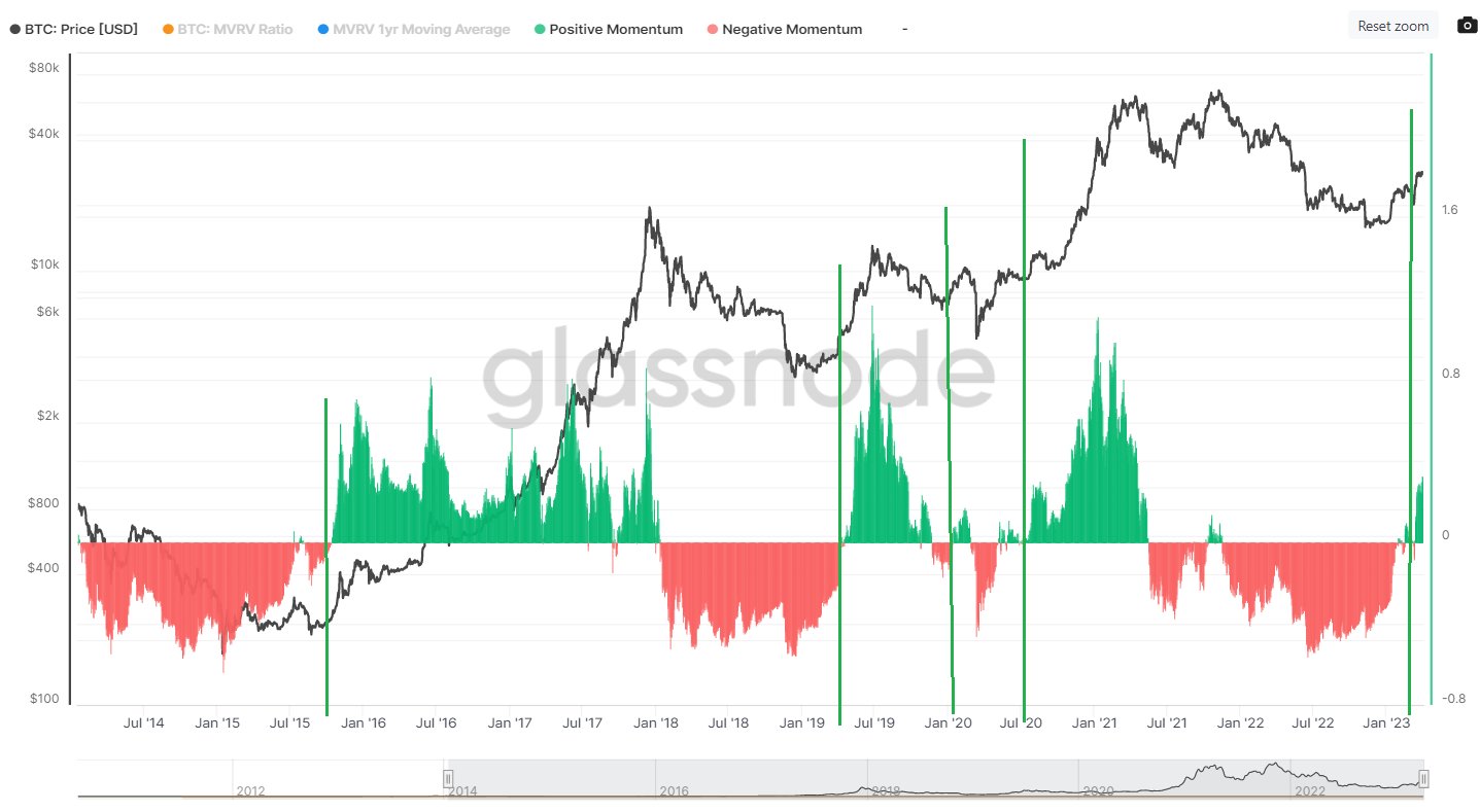
MVRV Momentum Oscillator
I’ve marked the last 5 times we saw a massive change in momentum. Only 1 failed: The Covid Shuffle

22/ To continue with the momentum shift.
Sell Side Risk Ratio
High values on this metric: High value realization & market volatility. Most often in late stage bull markets & Bear market capitulations.
Do you see the 3 last peaks? (May, June, Nov, do the maths)
Sell Side Risk Ratio
High values on this metric: High value realization & market volatility. Most often in late stage bull markets & Bear market capitulations.
Do you see the 3 last peaks? (May, June, Nov, do the maths)

23/ Low values are the opposite and go hand in hand with consolidation phases & sideways trends. These can signal Macro bottoms, accumulation floors & low sell side risk.
20K and lower was again the place to BTFD / DCA. We’ve only just left such a phase again on the metric.
20K and lower was again the place to BTFD / DCA. We’ve only just left such a phase again on the metric.

24/ #Bitcoin Cycle change detection
As it says, this is an indicator you can use to spot a late stage bear or Bull Market
As you can see, it has spotted both Bottom as Top ranges very fckin nicely
Again signals coincided with the sub 20K price levels, marking a floor
As it says, this is an indicator you can use to spot a late stage bear or Bull Market
As you can see, it has spotted both Bottom as Top ranges very fckin nicely
Again signals coincided with the sub 20K price levels, marking a floor

25/ This is also a fascinating indicator imo, as it has marked every Bear Market Bottom after a 4Y cycle (give or take)
What you see, marked in purple, is when the price of #Bitcoin trades below all cost basis models, signaling the average investor is holding an unrealized loss.
What you see, marked in purple, is when the price of #Bitcoin trades below all cost basis models, signaling the average investor is holding an unrealized loss.

26/ Market Cap / Thermocap
Can be used to see if the #Bitcoin price traded at a premium or not.
It paints the same picture, again. We’re just leaving the extreme discount zone, IMHO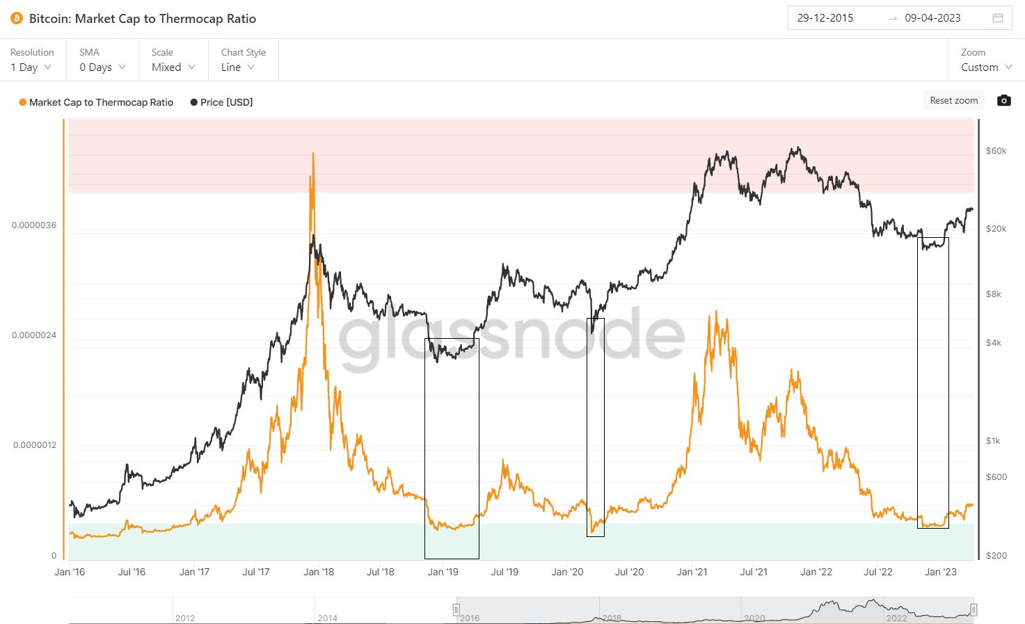
Can be used to see if the #Bitcoin price traded at a premium or not.
It paints the same picture, again. We’re just leaving the extreme discount zone, IMHO

27/ In the coming sector, I’d like to take a look at addresses / wallets. Has everybody indeed stacked their sats the last months?
28/ Non-Zero addresses are basically in an Up Only mode of course, but it’s good to have a look at the details.
At the time of the FTX drama you see a small dip, during the panic phase and little to no growth after, due to a lack of confidence around that time, which makes sense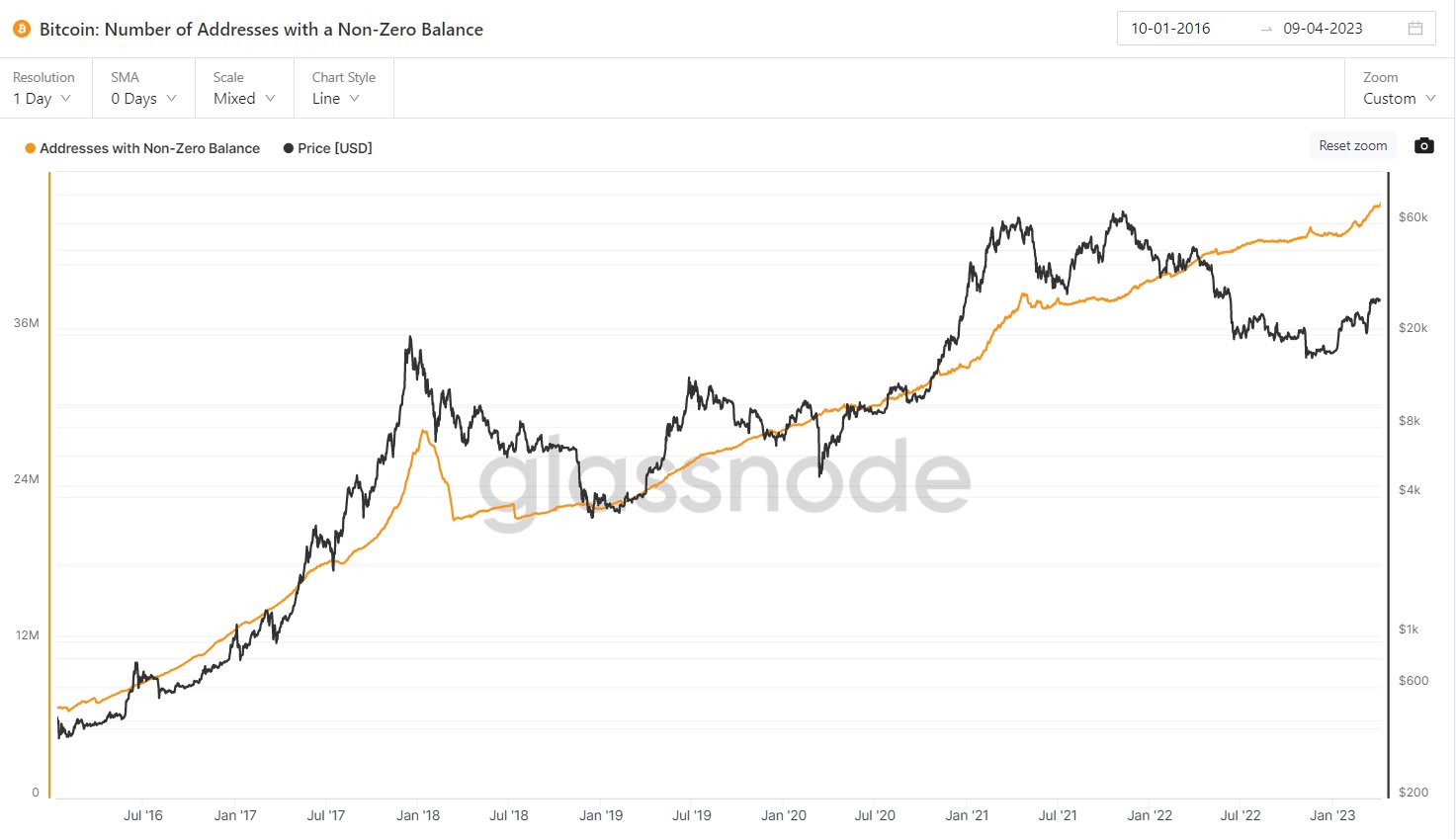
At the time of the FTX drama you see a small dip, during the panic phase and little to no growth after, due to a lack of confidence around that time, which makes sense

29/ The powerful boost above 20K lately brought back confidence as we see a substantial uptick of the Non-Zero addresses.
It signals strength overall imo.
It signals strength overall imo.

30/ A closer look at >1 $BTC addresses shows you that the FTX dip did actually get bought, but by more experienced and larger players, which also makes sense.
Bigger wallets are mostly owned by more experienced players, who actually BTFD.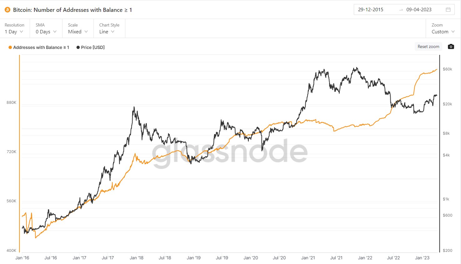
Bigger wallets are mostly owned by more experienced players, who actually BTFD.

31/ New addresses are also slowly rising & it’s good to see uptick spikes lately, which can assume that demand slowly starts growing again. 

32/ The number of total #Bitcoin addresses are still in an S-curve adoption stylish move, which has to be like this imo. 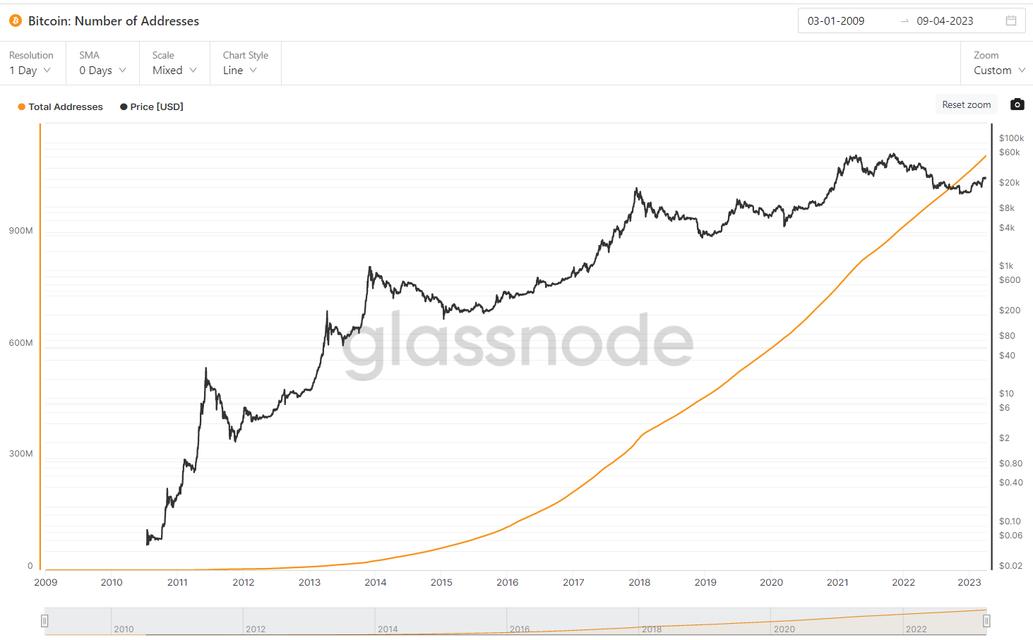

33/ I’d like to finish this thread with a few other indicators.
‘Balanced price’ tries to predict Bear Market Bottoms. Wait, we all fight each other trying to call the bottom and this one simply does call it?
Let’s hope it is right again, lol
‘Balanced price’ tries to predict Bear Market Bottoms. Wait, we all fight each other trying to call the bottom and this one simply does call it?
Let’s hope it is right again, lol

34/ Accumulation Trend Score
Light = No accumulation/distribution
Dark = Accumulation
I’d like to compare the current phase with quite heavy accumulation during a higher range to the summer of ‘20 where we saw the same, in an uptrending market.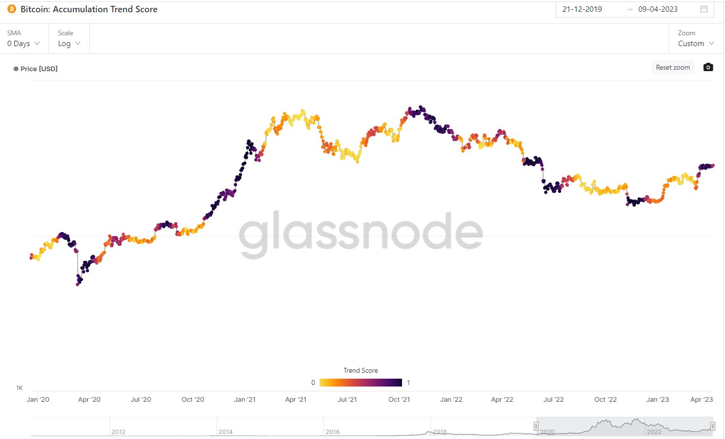
Light = No accumulation/distribution
Dark = Accumulation
I’d like to compare the current phase with quite heavy accumulation during a higher range to the summer of ‘20 where we saw the same, in an uptrending market.

35/ A #Bitcoin price below the 2-Y Moving Average is considered as cheap. Sub 30K is still cheap, htf
Start looking for exit liquidity when we get closer and closer to the red zone: The 2-Y MA x5.
Greedy in geen, get fearful at red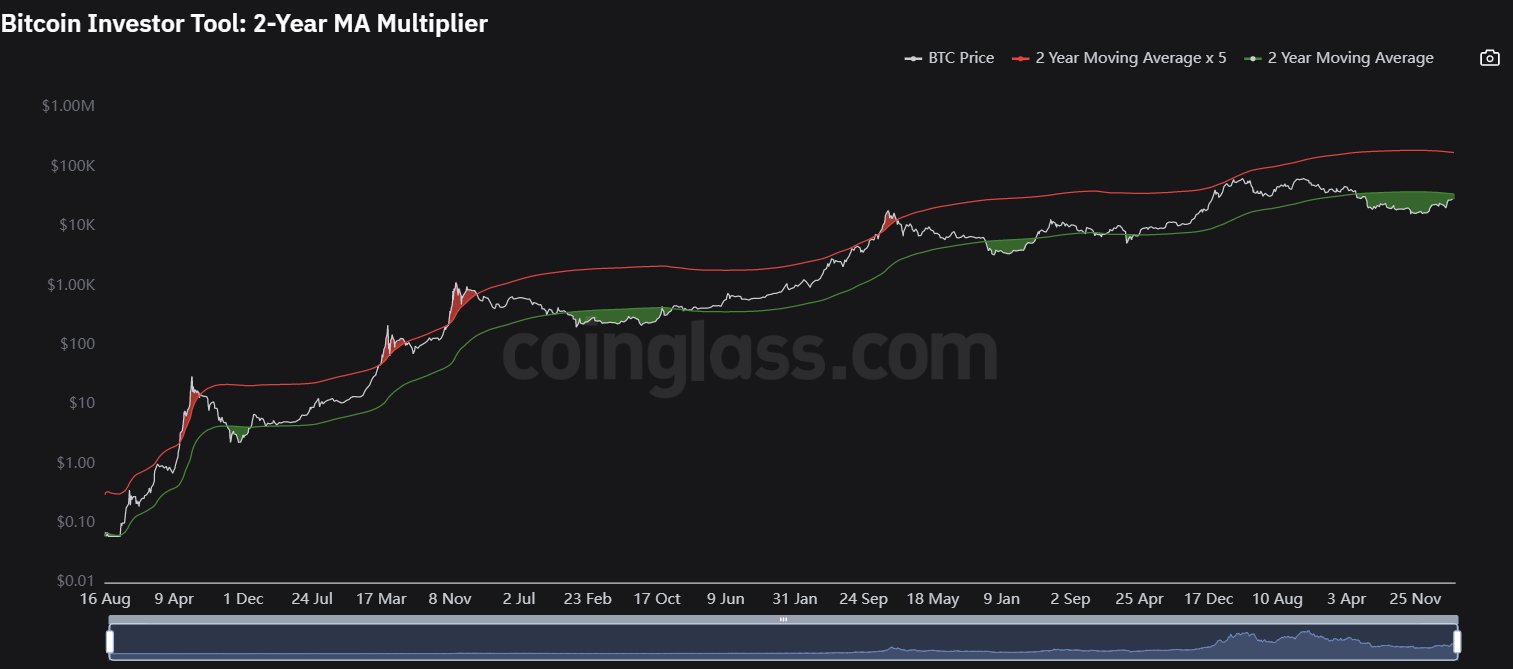
Start looking for exit liquidity when we get closer and closer to the red zone: The 2-Y MA x5.
Greedy in geen, get fearful at red

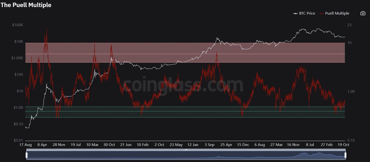
36/ The Puel Multiple
Miners and their revenue, like market cycles from a miners prospective.
Let’s make it easy again: Be greedy in the green zone, get fearful in the red zone.
Miners and their revenue, like market cycles from a miners prospective.
Let’s make it easy again: Be greedy in the green zone, get fearful in the red zone.
37/ Let’s wrap things up with the Bear/Bull Cycle chart
Bear Market bottoms did, IMHO, go hand in hand with a shitload of indicators above.
Paint your own picture with the information, take out what you need and never stop learning!
Bear Market bottoms did, IMHO, go hand in hand with a shitload of indicators above.
Paint your own picture with the information, take out what you need and never stop learning!

38/ If you liked this thread, consider sharing it by giving it a like & a RT of the first tweet, capped here :)
If you want to support me doing it more often, I personally give you a LIFETIME 40% fee reduction bingx.com/invite/1V6UHTKD
Have a great day!
If you want to support me doing it more often, I personally give you a LIFETIME 40% fee reduction bingx.com/invite/1V6UHTKD
Have a great day!

Mentions
See All
Scott Melker @scottmelker
·
Apr 11, 2023
Great thread.