Thread
the tweet detail ui really sucks rn. we know you hate it. we hate it too. we’re working on making it suck less. 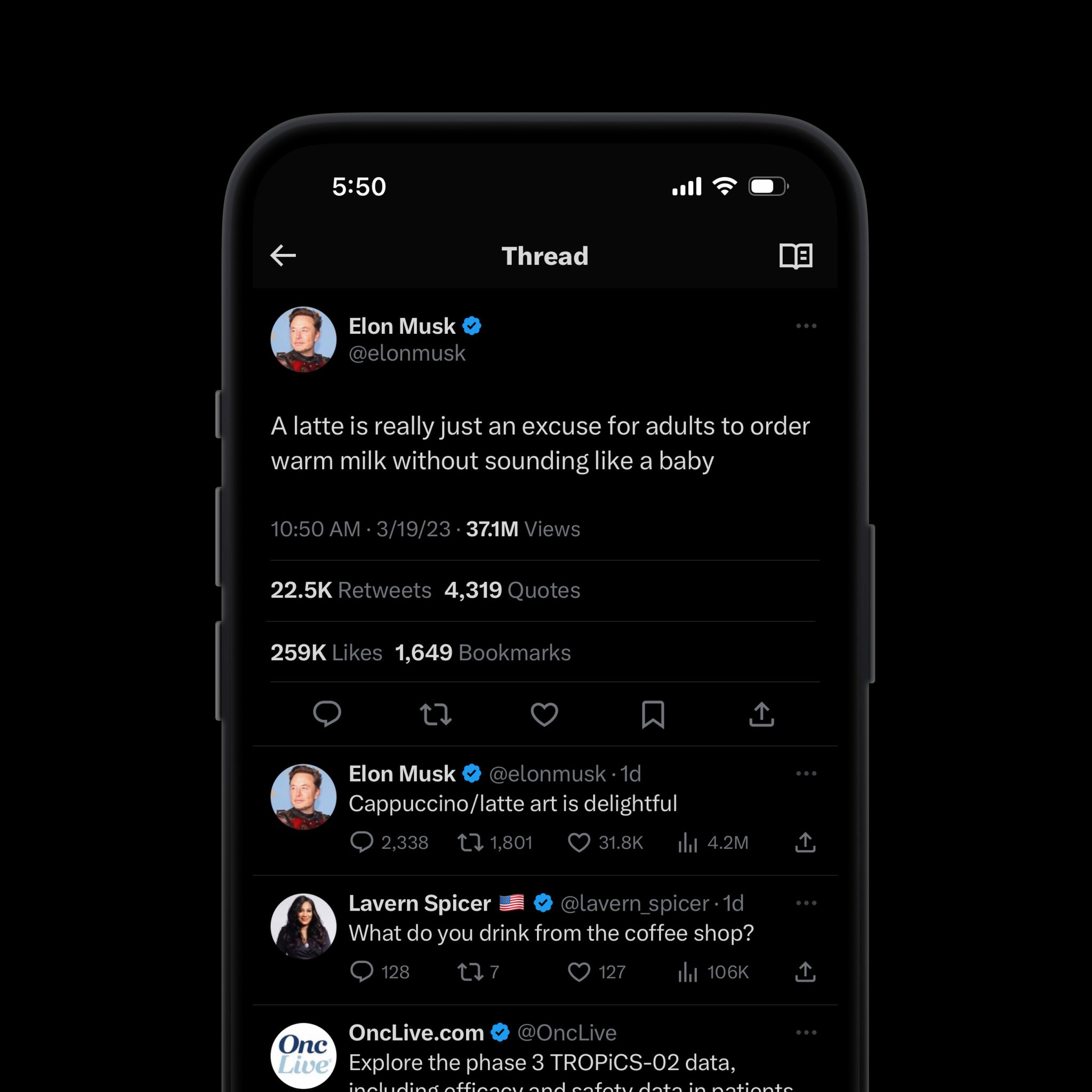

there’s been a lot added to twitter (& tweets specifically) over these last few months. love them or hate them, view counts & bookmarks are a part of the app now, but without rethinking the anatomy of tweets & detail pages, they’re clearly cramping our style.
there’s a lot we want to do with the tweet detail surface longer term (sorting replies etc), but we know that if we don't make some immediate, straightforward changes, the page is going to become completely unusable (not to mention even more impossible to look at).
we’re considering hundreds of micro-variations but there are a few areas we’re especially interested in.
i like the idea of:
1️⃣ modifying the user attribution so display name & handles are on the same line
2️⃣ consolidating the currently distinct date & time stamps into a single value (consistent with htl format)
3️⃣ moving this new label below the user details along w view counts
1️⃣ modifying the user attribution so display name & handles are on the same line
2️⃣ consolidating the currently distinct date & time stamps into a single value (consistent with htl format)
3️⃣ moving this new label below the user details along w view counts

i'd like to keep the engagement bar exclusive to actual engagement actions & their corresponding metrics. it shouldn't be a dumping ground for metadata. 

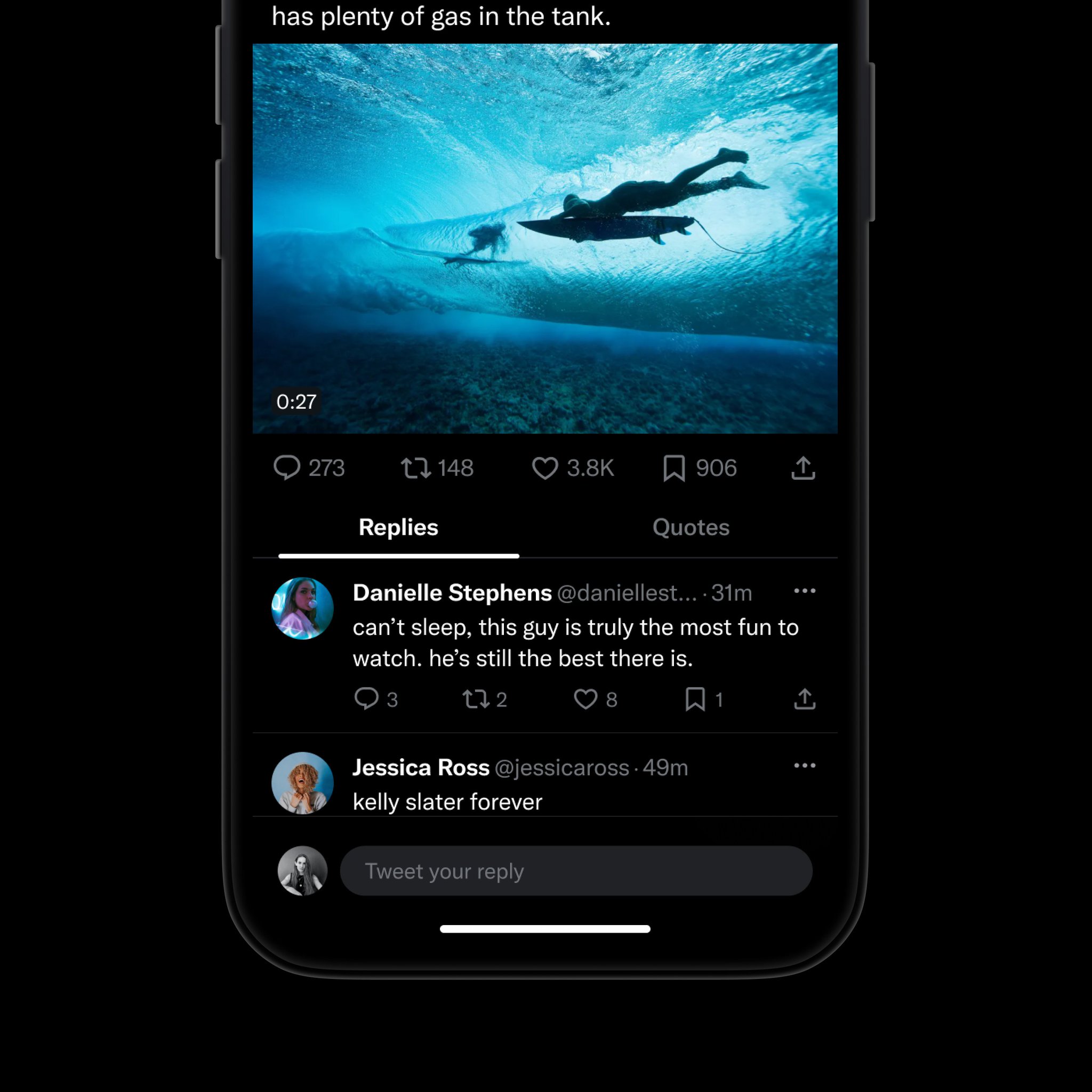
we're looking at tap targets & tabs & what functionality is most critical to this surface.
we’re wondering how important the like list is to people other than the tweet author. & similarly, how important is surfacing a retweets list from the tweet details ui?
we’re wondering how important the like list is to people other than the tweet author. & similarly, how important is surfacing a retweets list from the tweet details ui?


tldr; changes are coming.
we don't know exactly what they're going to look like yet, but we're working on them. as always, if you have feedback or ideas, we want to hear them - so please let us know!!
we don't know exactly what they're going to look like yet, but we're working on them. as always, if you have feedback or ideas, we want to hear them - so please let us know!!
Mentions
There are no mentions of this content so far.