Bill Gates @BillGates
·
Mar 18, 2015
Bill Gates @BillGates
·
Mar 18, 2015
- Curated in 6 books I recommended for TED 2015
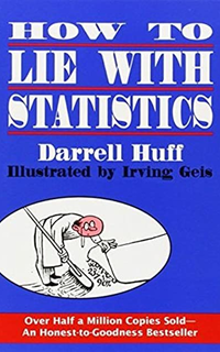
I picked this one up after seeing it on a Wall Street Journal list of good books for investors. It was first published in 1954, but it doesn’t feel dated (aside from a few anachronistic examples—it has been a long time since bread cost 5 cents a loaf in the United States). In fact, I’d say it’s more relevant than ever. One chapter shows you how visuals can be used to exaggerate trends and give distorted comparisons. It’s a timely reminder, given how often infographics show up in your Facebook and Twitter feeds these days. A great introduction to the use of statistics, and a great refresher for anyone who’s already well versed in it.

Replies
No replies yet