Diving deep into z-index property
You may have come across various overlap effects in websites where for example we can have an image on top of another image with some background color on the side just like the image below.

And if you ever tried to inspect that code in Developer Tools then you have already been introduced to the easily ignored CSS topic — “z-index property” which may sometimes contain large, bizarre positive or negative integer values.
Don’t let those large numbers scare you!
Once you understand how z-index property works and few important concepts around it, you’ll be able to assign it values that make much more sense and not just random numbers which are difficult to keep a track of.
How browser places elements on a page?
Let’s start by looking at how a browser goes about placing the HTML elements on web page.
When a browser reads any HTML file, the first thing it does is create a DOM tree. DOM tree basically means the Document Object Model where each element is represented as a node of the tree.

After the DOM tree, browser then reads the CSS Stylesheet and creates another tree known as CSS Object Model (CSSOM).
CSSOM and DOM tree together make up a third tree known as Render Tree.
On the basis of this Render Tree, browser starts displaying all the elements on a web page in a certain order where elements can either be on top or behind other elements. This order of elements is known as stacking order.
This brings us to our first concept: “Stacking Order”.
What is Stacking Order?
It is the order in which elements are rendered on a web page. Normally, browsers follow a natural stacking order to place elements which means elements appear in the order they are written in the HTML file.
Look at the below code. We have here 4 <div> tags and 2 <span> tags. Another <div> with class “circle” is placed inside <div> with “container” class.
  <div class='box green'></div>
  <div class="container">
      <div class='circle'></div>
  </div>
  <div class='box blue'></div>
  <div class='box purple'></div>
  <span>Hello</span>
  <span>There!</span>
Block level elements take up a new row, leaving space above and below it. Inline elements appear on the same line and have width according to their content.
<div> is a block level element so all 4 boxes appear on a new line. <span> is an inline level element. Therefore both <span> tags appear side by side in the same row.
You can notice here that all these elements render on the page in the order they are written in code. Green box is written first in code so it also appears first on the page followed by “container”, blue box , purple box and 2 <span> tags.
Even when we have non-positioned elements overlapping each other, the element written afterwards in the code appear on top of elements written above them.
  <div class="circle blue"></div>
  <div class="circle aqua"></div>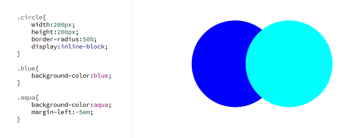
How to change Stacking Order?
Position property along with z-index is used to change this natural stacking order. With these properties we can easily place an element on top of another element even if it comes before that element in code.
Note : All elements by default have position : static property so we can not use static value to change stacking order.
Case 1 : Between Positioned and Non-Positioned Elements
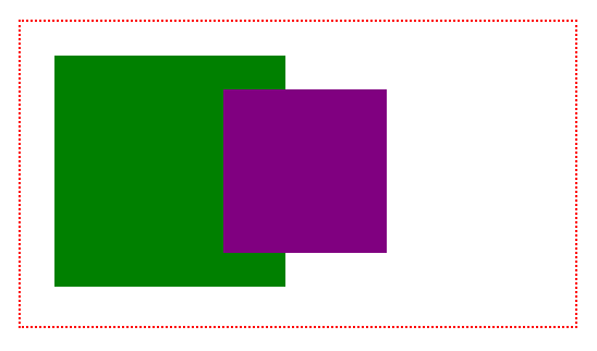
Inside a “container” <div>, I’ve written 2 <div> tags for green box and purple box. Only purple box is given position : relative property.
<div class="container">
    <div class="green"></div>
    <div class="purple"></div>
</div>
.container{
    border: 2px dotted red;
    padding:1.5em;
}

.green{
    width:170px;
    height:170px;
    display:inline-block;
    background-color:green;
}

.purple{
    width:120px;
    height:120px;
    display:inline-block;
    background-color:purple;

    /* adding position : relative */
    position:relative;
    left:-50px;
    top:-25px;
}
Positioned elements always appear on top of non-positioned elements. Because only purple box is given position property, it appears on top of green box.
Case 2: Between Positioned Elements
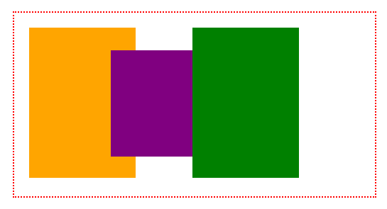
Here I’ve taken 3 boxes — orange , purple and green. All three boxes are given position property.
<div class="container">
    <div class="box orange"></div>
    <div class="box purple"></div>
    <div class="box green"></div>
</div>
.container{
    border: 2px dotted red;
    padding:1em;
}

.box{
    width:120px;
    display:inline-block;
    position:relative;
}
Positioned elements follow the natural stacking order among themselves. So green box appears on top of purple box and purple box is on top of orange box.
We can use z-index property to change this order.
Here I’ve given z-index : 3 to orange box , z-index : 2 to purple box and z-index : 1 to green box.
.orange{
    height:170px;
    background-color:orange;
    z-index:3;
}

.purple{
    height:120px;
    background-color:purple;
    top:-1.5em;
    left:-2em;
    z-index:2;
}

.green{
    height:170px;
    background-color:green;
    left:-4em;
    z-index:1;
}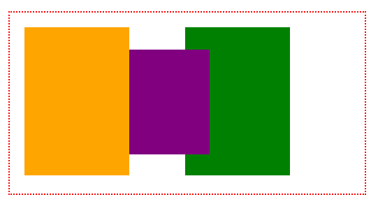
You can see that orange box is on top of purple box which is on top of green box. Elements with higher z-index value appear on top of elements with lower z-index values.
Note : z-index property does not work on non-positioned elements. Applying z-index without position property will show no change to element.
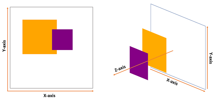
What is z-index property?
On a page, elements can be placed along x-axis(horizontally) and y-axis(vertically). Z-index places elements along the z-axis which means it brings elements closer to the screen if they overlap each other.
Syntax :
z-index : auto | number | initial | inherit;We can assign positive and negative values for z-index. Elements with higher z-index value will be closer to screen and hence appear on top of elements with lower z-index values.
We already saw positive z-index values. Let’s now look at negative values.
Assigning negative z-index values :
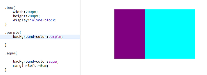
In this example, I’ve taken a “container” <div> to hold 2 boxes — purple and aqua.
<div class="container">
    <div class="box aqua"></div>
    <div class="box purple"></div>
</div>
.container{
border: 4px dotted red;
padding:3em;
background-color:beige;
}
.box{
width:120px;
display:inline-block;
position:relative;
}
.aqua{
height:200px;
width:200px;
background-color:aqua;
}
.purple{
height:120px;
background-color:purple;
top:-1.5em;
left:-2em;
}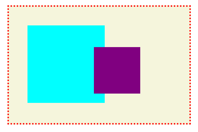
This is how both the boxes appear on page. Let’s add a negative z-index value to purple box and see the changes.
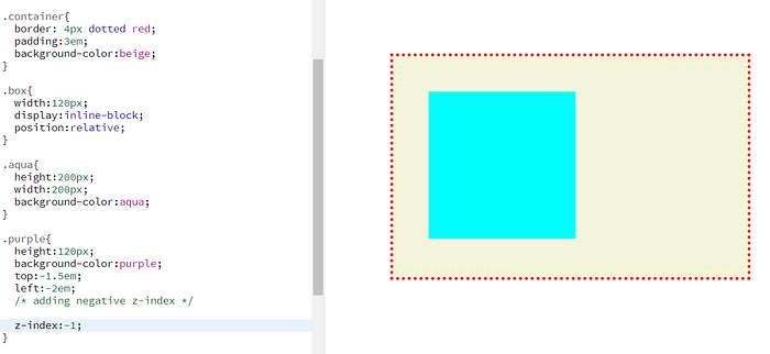
I’ve added z-index : -1 to purple box and now its hidden from the screen. Can you guess where it went? It is behind its parent which is “container” <div> in this case.
To solve this we need to add position: relative and a z-index value to “container”.
.container{
    border: 4px dotted red;
    padding:3em;
    background-color:beige;

    /* position property and z-index */

    position: relative;
    z-index: 1;
}

.purple{
    height:120px;
    background-color:purple;
    top:-1.5em;
    left:-2em;
    /* adding negative z-index */

    z-index:-1;
}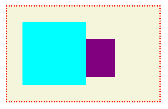
Now our purple box is visible and behind the aqua box as it should have earlier. Even if we use higher negative values for purple box like -9999 it won’t go behind “container” again because purple box is now part of a new stacking context.
This brings us to our second concept: “Stacking Context”.
What is a Stacking Context?
Stacking context is a group of elements which have a common parent tag. All these child elements move forward or backward together according to their parent’s z-index and their individual z-index values only work within the common parent.
Let’s take an example to understand this in detail.
I have taken 2 “container” <div> tags with class — “parent1” and “parent2”. Both of them have 2 circles. All these elements are assigned different z-index values as you can see in the CSS code.
  <div class="container parent1">
      <div class="circle purple"></div>
      <div class="circle orange"></div>
  </div>

  <div class="container parent2">
      <div class="circle blue"></div>
      <div class="circle yellow"></div>
  </div>
  .container{
      display:inline-block;
      background-color:beige;
      position:relative;
  }

  .parent1{
      width:300px;
      height:300px;
      border:3px dashed red;
      left:7em;
      top:2em;

      /* z -index for parent1 */
      z-index:1;
  }

  .parent2{
      width:250px;
      height:250px;
      border:3px dashed green;

      /* z -index for parent2 */
      z-index:2;

  }

  .circle{
      width: 120px;
      height:120px;
      border-radius:50%;
      position:relative;
  }

  .purple{
      background-color:purple;
      left:40%;
      /* z -index for purple circle */
      z-index: 3;
  }

  .orange{
      background-color:orange;
      top:-10%;
      left:40%;

      /* z -index for orange circle */
      z-index: 4;
  }

  .blue{
       background-color:blue;

      /* z -index for blue circle */
       z-index: -1;
  }

  .yellow{
       background-color:gold;
       top:-15%;
      /* z -index for yellow circle */
       z-index: -2;
  }
What do you think will be the order of these 6 elements?
Let’s see.
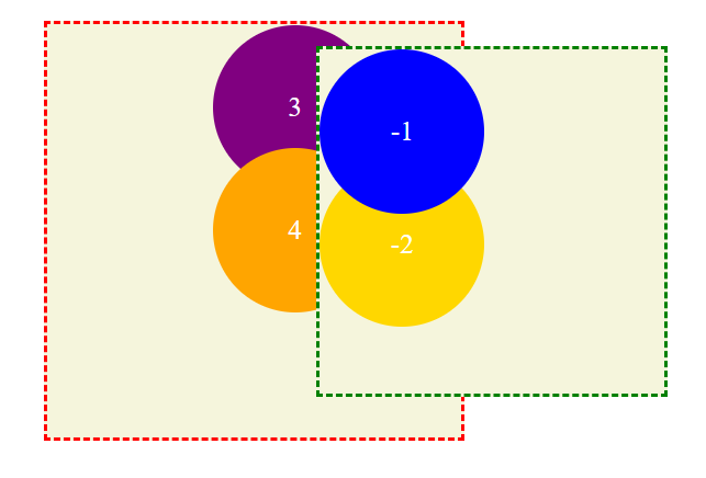
Here “parent1” with z-index value 1 is behind “parent2” with z-index value 2 as expected. But we notice that both purple circle and orange circle are also behind “parent2” even when they have higher z-index values ( 3 and 4 respectively).
Also the blue circle and yellow circle with negative z-indexes are on top of every other element.
An element with position property(other than static) and z-index value (other than auto) creates a new stacking context. In our example both “parent1” and “parent2” create a separate stacking context.
All the child elements within a stacking context follow the z-index of their parent when compared against other stacking context. Both purple circle and orange circle follow z-index value 1 ( parent1’s z-index value) against “parent2” and so they appear below it.
z-index values can only be compared against an element’s siblings. Stacking context needs to be same when we want to change stacking order of elements.
Within each “container”, circles follow their own z-index values and place accordingly.
When is a Stacking Context created?
Other than adding position property and a z-index value, there are few other ways to create a stacking context.
- setting opacity other than 1
- using transform property other than value none
- flex box and grid containers
- using filter property other than value none
- using isolation property
- with clip-path property
You can checkout the complete list here.
Root element <html> is the default stacking context.
Let’s take a look at few of the above cases.
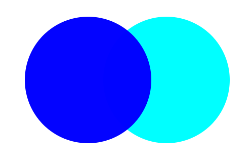
Case 1 : Opacity Property
I have taken 2 circles. Aqua circle comes below blue circle in code so it appears on top of blue circle.
To get our blue circle on top of aqua circle, we will try adding just opacity property to it.
 .blue{
        background-color:blue;
        opacity:0.99
     }
Voila! Our blue circle is now on top of aqua circle. We created a new stacking context with opacity property.
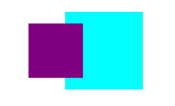
Case 2 : Transform Property
I have taken 2 boxes. Aqua box comes below purple box in code so it appears on top of purple box.
Now let’s add transform property on purple box to get it on top.
.purple{
        background-color:purple;
        transform: scale(0.7);
      }
There you go! Purple box is on top of aqua box.
Summing up order of stacking context :
The child elements of a stacking context appear from top to bottom in the following order —
- elements with z-index of 1 or higher
- elements with position property and no assigned z-index value
- non-positioned elements
- elements with negative z-index values
Conclusion
Throughout this article we dived deep into z-index property. We learnt about stacking order, what it is and how we can change it for different scenarios. We then looked at another important concept which is Stacking Context and how it plays a role in comparing z-index values.
That’s it for this article. Thank you for reading!! 😊
If you found this article helpful, please click the clap 👏button and feel free to comment down your feedbacks!! I would love to read them and improve. For more content around CSS you can also follow me on Twitter.
