Executive Summary
With historically high rates of inflation, and the threat of higher global oil and food prices from the war in Ukraine, measures of consumer sentiment have begun to signal substantial dissatisfaction with today’s economy. With President Biden’s polling numbers on economic issues falling, reporters and economic commentators have been trying to understand why Americans are so dissatisfied, despite the historically strong labor market recovery.
In piecing together the story, many have turned to the easy, yet misleading, metric of “real wages.” If more Americans are making more money, the logic goes, the only reason they would be unhappy with the economy would be if prices are rising even faster than wages, eating into household purchasing power. The problem is, despite seeming simple on the level of economic theory, real wage measures built using the data sources we have today are not a coherent barometer for monitoring the real-time evolution of standard of living, especially over the short run.
However, the problems with real wage measures run deeper.
- Fiscal Transfer Benefits: The recession and recovery were supported by abnormally robust fiscal transfer payments to households (EIP/UI) not counted in real wage measures.
- Employment Nonlinearities: Net employment gains—which amount to infinite real wage gains for newly employed persons—have been historically strong in this recovery, but go unaccounted in real wage measures.
- Volatility Effects: A few specific volatile prices usually play a substantial role in shaping the short run evolution of real wage measures.
- Wage Measurement Flaws: There are multiple measures of wages, each with its own strengths and flaws, and none of which is strictly superior.
- Price Measurement Flaws: There are also multiple measures of prices that are equally defensible choices for evaluating real wages.
- Whose Wage? And Whose Price Basket? The Absence of Microdata: Real wages measures are derived from independent aggregates, not household-level observations of both wages and expenditure baskets.
With all of these problems and ambiguities, real wage measures quickly reveal themselves to be a veritable orchard for those looking to cherry pick data points for specific narratives. If we take a holistic view of the universe of valid real wage measures - looking at the orchard instead of the cherries - we get an unsatisfying and ambiguous picture of where real wages stand relative to their pre-pandemic levels. It is as possible to construct valid measures of real wages that show sizable real wage gains as it is to show real wage declines.
Ultimately, the dissatisfaction with the economy might be simpler than this tangled mess of metrics suggests. Focusing on real wages - which are difficult and contentious to measure conclusively - also ignores the politically simpler fact that people just don’t like inflation. Even if they are materially better off - as many low-income households likely are - inflation produces uncertainty which erodes the feeling of security that traditionally attends an increasing income. This is, frankly, understandable in light of the striking effect that rising rent, food, and energy costs can have on households as a whole, and low-income households in particular.
The Mess of Real Wages
There is a growing sense in recent economic commentary that workers have – after adjusting for inflation – seen their real wages fall during the pandemic. It is true that the pandemic has seen wide swings in both labor markets and inflation. Households saw dramatic increases in cash transfers, while workers in tight labor markets have seen wage increases at the margins. However, at the same time as households’ financial positions appear to be improving, inflation has reached historic new highs. If household incomes have gone up, but prices have gone up further, those higher incomes buy fewer things.
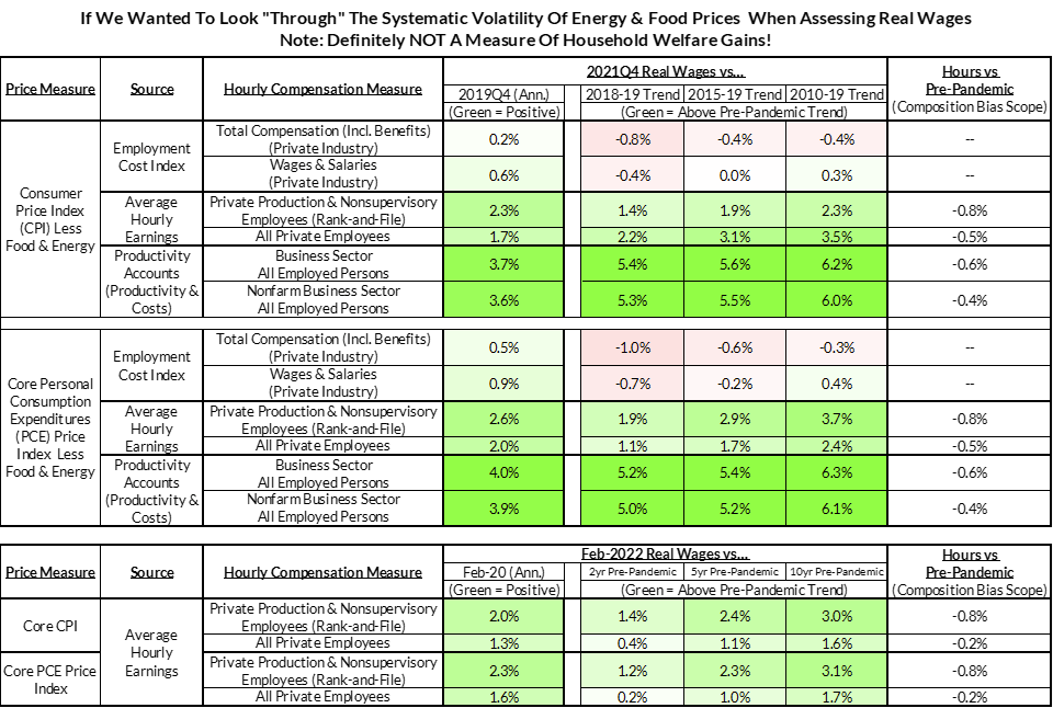
Yet when we look at the Bureau of Labor Statistics’ Productivity and Costs estimate of real hourly compensation, we see something different.

Per this chart, real wages have been surging relative to long-term trends since the beginning of the pandemic. This isn’t a cause for triumph; it is, in fact, weird.
The first, major, red flag comes from the fact that the greatest gains come at the exact moment that millions are losing their jobs in March and April of 2020. If everyone was being laid off or furloughed, how could real wages be rising? Simple: oil prices had gone negative. While that might seem unrelated, oil prices are one of the most volatile components of the price indices that estimates of real wages use to deflate nominal wages. When the price of oil falls, the denominator of real wage measures shrinks, and real wages rocket upwards. Today, we’re seeing this same process in reverse: as oil prices spike due to the war, virtually all measures of “real wages” will decline for 2022Q1.
Composition biases within wages also help explain some of this weirdness, especially in the early months of the pandemic. If more low-wage than high-wage workers are laid off in a recession, then the numerator of most “real wage” measures will rise. This seems perverse, but is a natural artifact of metrics which only look at the level of wages among wage-earners. In the chart above, total hours worked had largely recovered by 2021Q4, so this particular problem is likely less salient today, but played a clear role in the early-pandemic spike in real wages.
Yet, if we construct the same chart but swap the BLS’s Productivity & Costs wage estimate for the Employment Cost Index as the measure of nominal wages, things look completely different.

So which of these two charts are “right”? Well, it all depends on which specific measurement issues one is looking to avoid. The absence of composition bias means the Employment Cost Index is usually a better indicator of real-time wage changes, but there are some additional considerations here. Although ECI corrects the composition bias of the Productivity & Costs estimate this bias is less of an issue today since hours worked have largely recovered.
A further complication for the ECI measure is the fact that it is a Laspeyres index, which is always calibrated to the occupational and sectoral composition of employment in previous periods. This means that transitions of workers from low-wage occupations to higher-wage occupations—a dynamic that seems likely given the shifting sectoral composition of employment and elevated job switching—are captured with more of a lag in ECI. Average hourly earnings—a measure of total dollar payroll divided by total hours worked—and the Productivity and Costs estimate of hourly wages are likely to pick up these transitions.
If all of this nuance weren’t confusing enough, we’ve only dealt with the top half of the ratio. The bottom half, inflation, is equally finicky, but thankfully there are fewer measures than for wages. If you use the Fed's preferred inflation gauge—the Personal Consumption Expenditures Price Index—you will get a lower measure of inflation than you would with CPI. Part of this is about different weights, different sources of consumption that are counted (or not counted), and different methods for measuring certain prices. The two are similar in most respects, but little changes can yield amplified differences when assessing the level of real wages.
The real problem with all of these metrics, which seem to imply a range of contradictory outcomes, is that they are all strictly “correct.” What makes the situation with real wages so tricky is that they both correctly capture different approaches to measuring “real wages.”
There is no clear reason to prefer one specification over another that doesn’t require an extremely in-the-weeds justification based on the differences in the construction of aggregates. In the absence of a widely shared understanding of these weedy details —questions of survey design, sample selection, and indicator construction that mainstream commentators shy away from—the notion of “real wages” is an absolute orchard for cherry pickers. As in everything with the economy, ideas that seem simple in theory—here, wages, but adjusted for inflation—are often so empirically squishy that the measurements are rarely more than deeply ambiguous. However, with that being said, there are six clear problems with existing real wage measures. While this list won’t teach you how to construct a specifically “correct” metric of real wages—something economists have struggled with for centuries—it will certainly help you discount arguments based on cherry-picked “real wage” data points.
Six Problems With Measuring Real Wages
While developing a perfect real wage measure would require household-level data on income and consumption stretching back years, we can provide a handy list of the problems likely to arise when using any of the array of readily-available real wage measures:
1) Fiscal Transfer Benefits:
Even if the chosen real wage measure reveals a decline relative to the pandemic, keep in mind that the federal government topped up the incomes of millions of American households through Economic Impact Payments and Pandemic Unemployment Assistance. Fiscal transfers served as income-replacement measures during the pandemic, and more than offset the declines evident in certain measures of real wages.
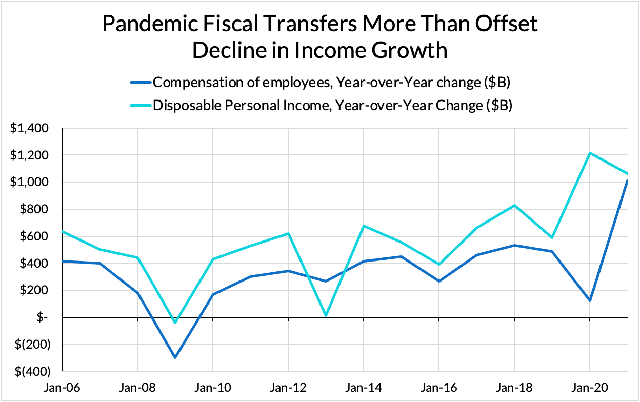
The scale of these pandemic fiscal transfers is particularly striking relative to the response to 2008.

2) Employment Nonlinearities:
A newly-employed worker who had been previously unemployed has seen infinite growth in their real wages, but is systematically excluded from all real wage measures. That person, who previously had to plan consumption without the existence of a stable income, now can consume with greater financial comfort. Real wage measures implicitly exclude the newly (net) employed person, even though in recoveries from recessions, this is the situation of millions of people.

3) Volatility Effects:
The dirty secret about short-term changes in real wages is that they are almost always driven by oil prices. Although nominal wages tend to matter more in the longer run, prices are more volatile than wages over the shorter run. Since real wages typically use headline inflation to deflate nominal wage measures, the biggest contributor to headline price inflation volatility—usually gasoline prices—is the underlying factor. When we're talking about short run changes in real wages, what we're really talking about—most of the time—is oil and motor fuel price changes.

Although it doesn’t produce a measure of welfare, deflating by core inflation does remove some big biases that might emerge if the relevant period involves massive oil price changes, which remain the largest contributor—among components—to CPI and PCE price index volatility.
4) Wage Measurement Flaws:
All wage measures have strengths and weaknesses, with no strictly superior indicator.
- The Employment Cost Index (ECI) is probably the best for evaluating wages in real-time—that too in a way that controls for the changing composition of the workforce amidst business cycle shocks. But it also has lagging properties in how it captures wage gains from workers who switch from lower-paying occupations into higher-paying occupations.
- Average Hourly Earnings (AHE) is better at capturing the wage gains associated with occupational transitions that ECI is slow to catch. However, it tends to confuse average wage gains with marginal wage gains: it can swing up as lower wage workers are disproportionately fired only to swing down as they are disproportionately hired. Estimates that try to directly adjust for this effect suggest real wage gains in the two years following the pandemic. National accounts and productivity-based measures of hourly wages have similar strengths and weaknesses.
- The Atlanta Fed Wage Tracker should control for job-switching best, but it also has such a small sample size and engages in heavy selection bias by limiting its observations to those persons continuously employed across 12-month periods. That can lead to volatile readings and miss millions of workers affected by recession and recovery. Moreover, you cannot simply derive a "wage index" from its readings because the monthly wage changes experienced by those surveyed in the January of each year are not necessarily consistent with those surveyed in the February—or any other month—of each year.
5) Price Measurement Flaws:
Just as there is no perfect wage aggregation, there is also no perfect price aggregation. Both the Consumer Price Index (CPI) and the Personal Consumption Expenditures Price Index (PCE) include imputed sources of consumption, but PCE more so. On the other hand, PCE tends to do a better job accounting for substitution biases. This is especially relevant now, given the dynamic shift in consumption from services to goods. With the outsized role of gasoline prices in real wage volatility, excluding such volatile prices carries some merit, even though it goes completely against the purpose of measuring real wages.
6) Whose Wage? And Whose Price Basket?
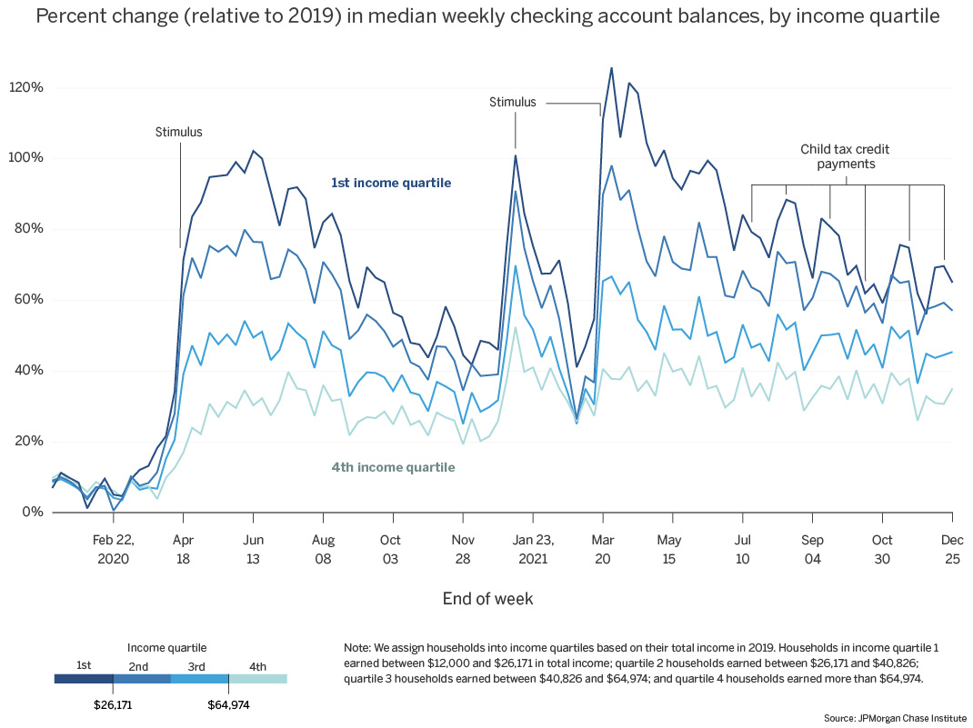
The worst aspect of real wage discussions is that we do not have data corresponding to a given household from which we can actively track simultaneously 1) the evolution of their (wage) income and 2) the evolution of their expenditures (and corresponding prices). Until we assemble such a dataset, we can only imperfectly triangulate around distributional questions. In addition to our own estimates of inflation across the distribution, checking account balance data—an imperfect proxy—suggests that income gains likely outpaced expenditure gains in both 2020 and 2021.